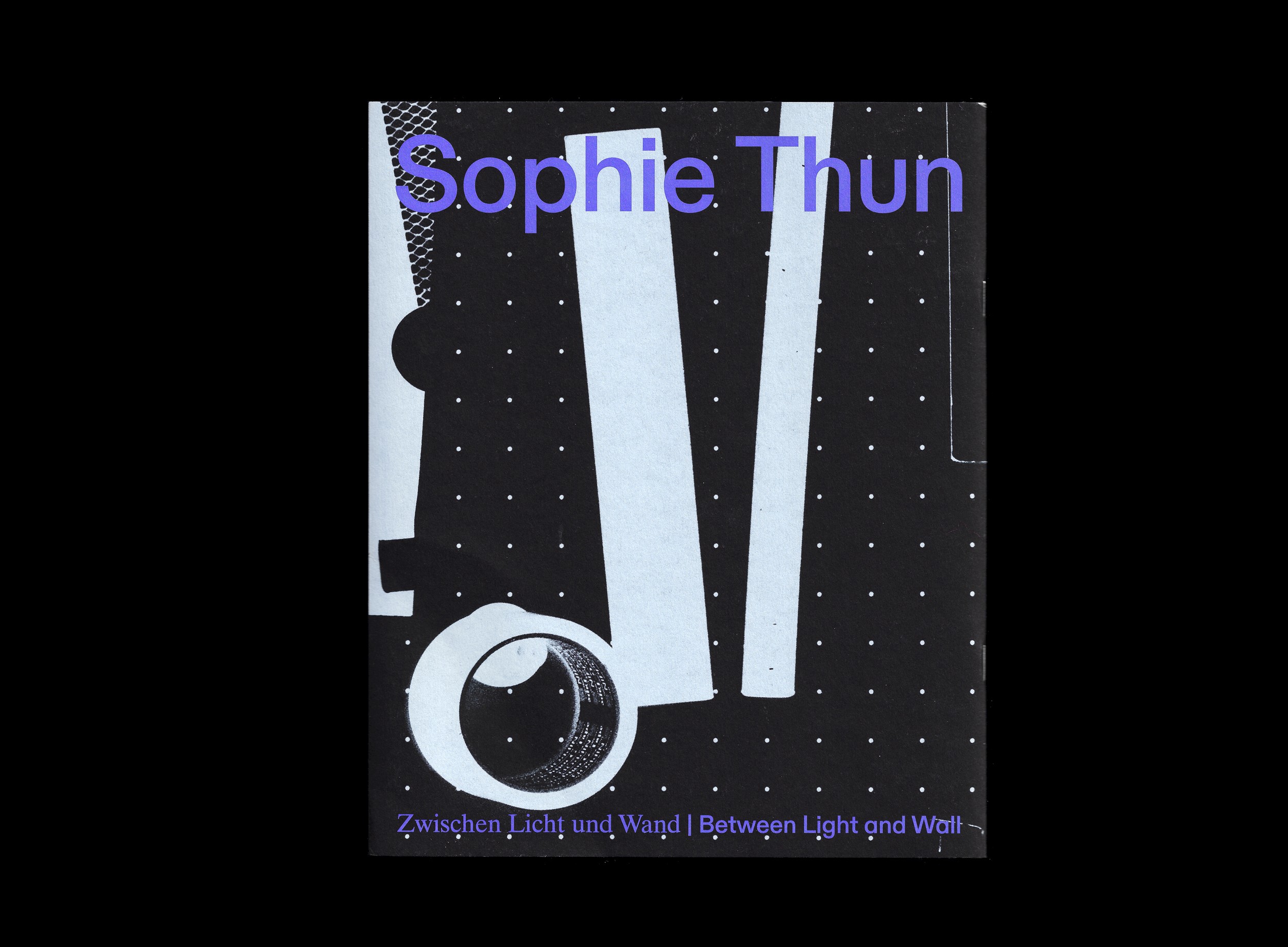
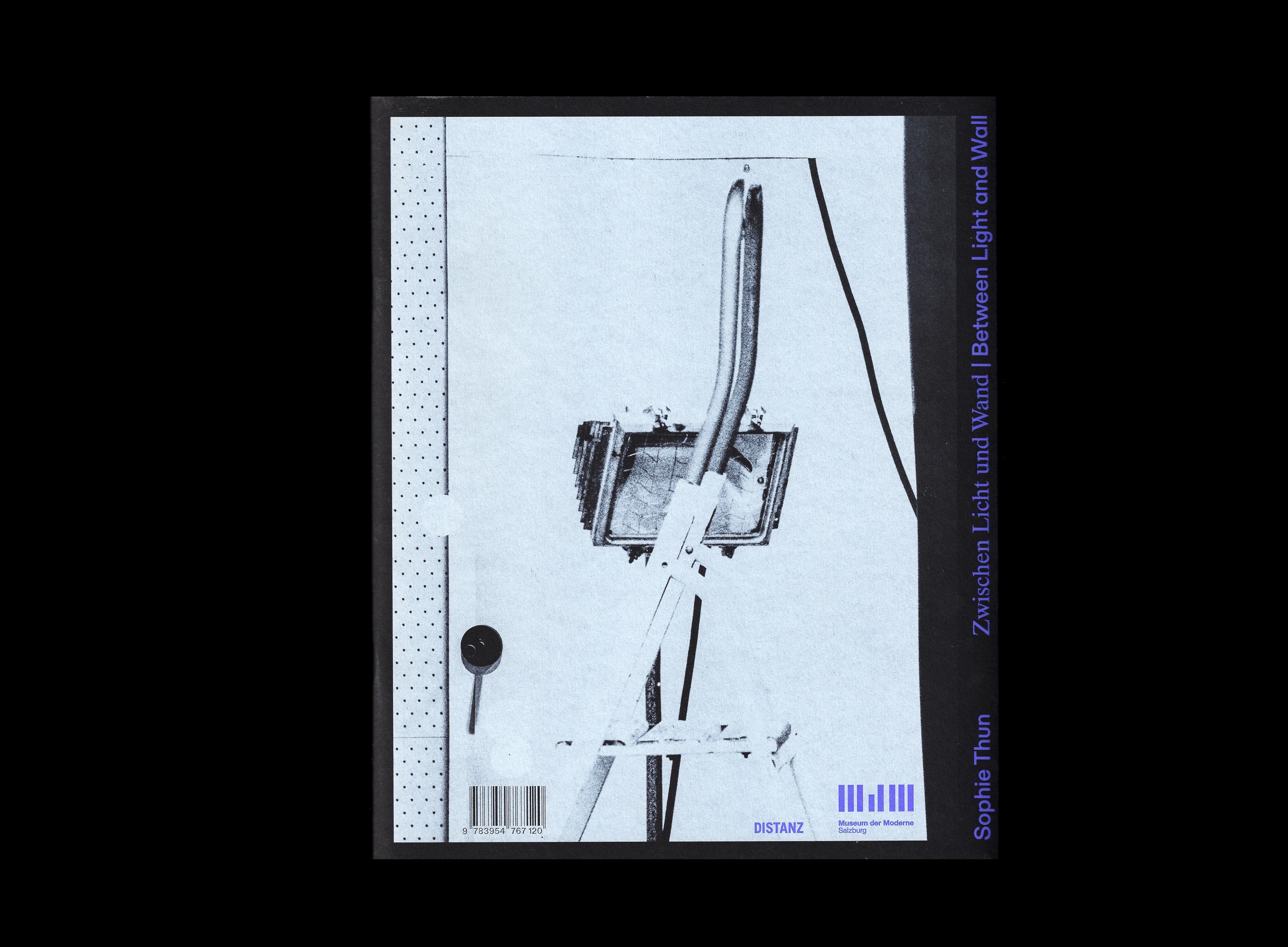
Sophie Thun. Zwischen Licht und Wand | Between Light and Wall
- Editor(s): Harald Krejci und Marijana Schneider/ Museum der Moderne Salzburg
- Publisher: DISTANZ
- Year: 2024
- Size: 20 × 25 cm
- Number of pages: 128
Exhibition catalogue for the eponimous exhibition at at Museum der Moderne Salzburg.
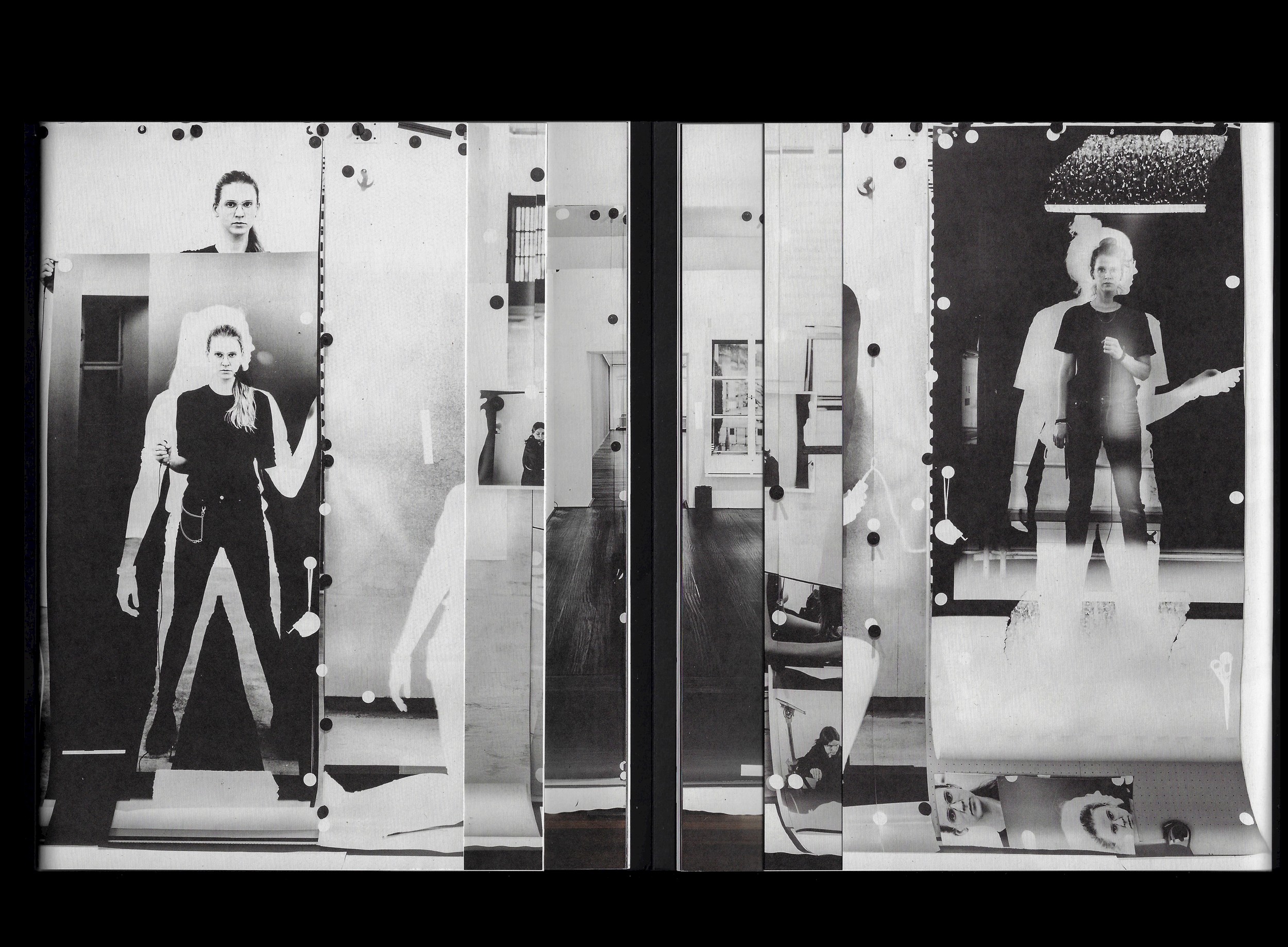
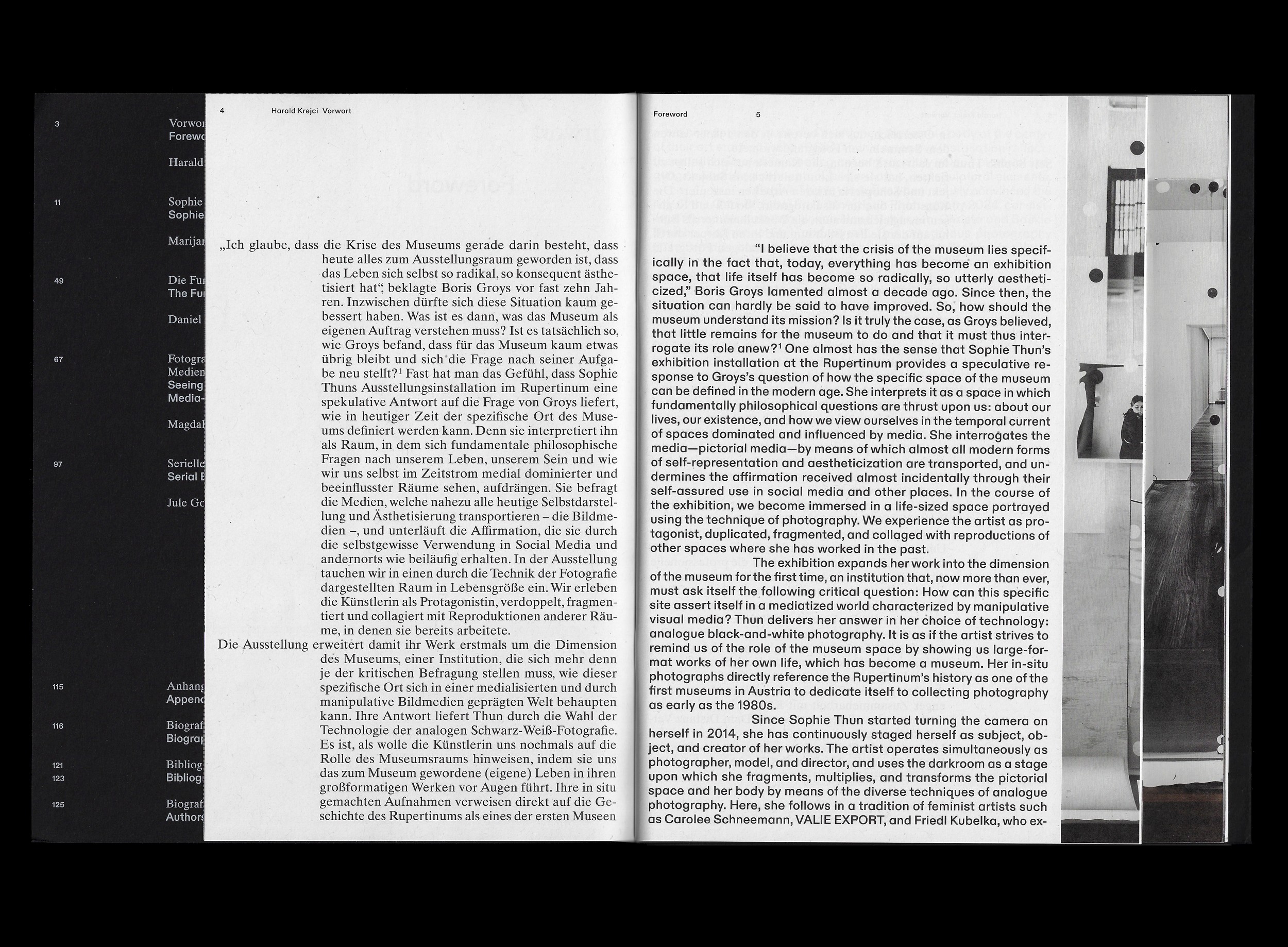
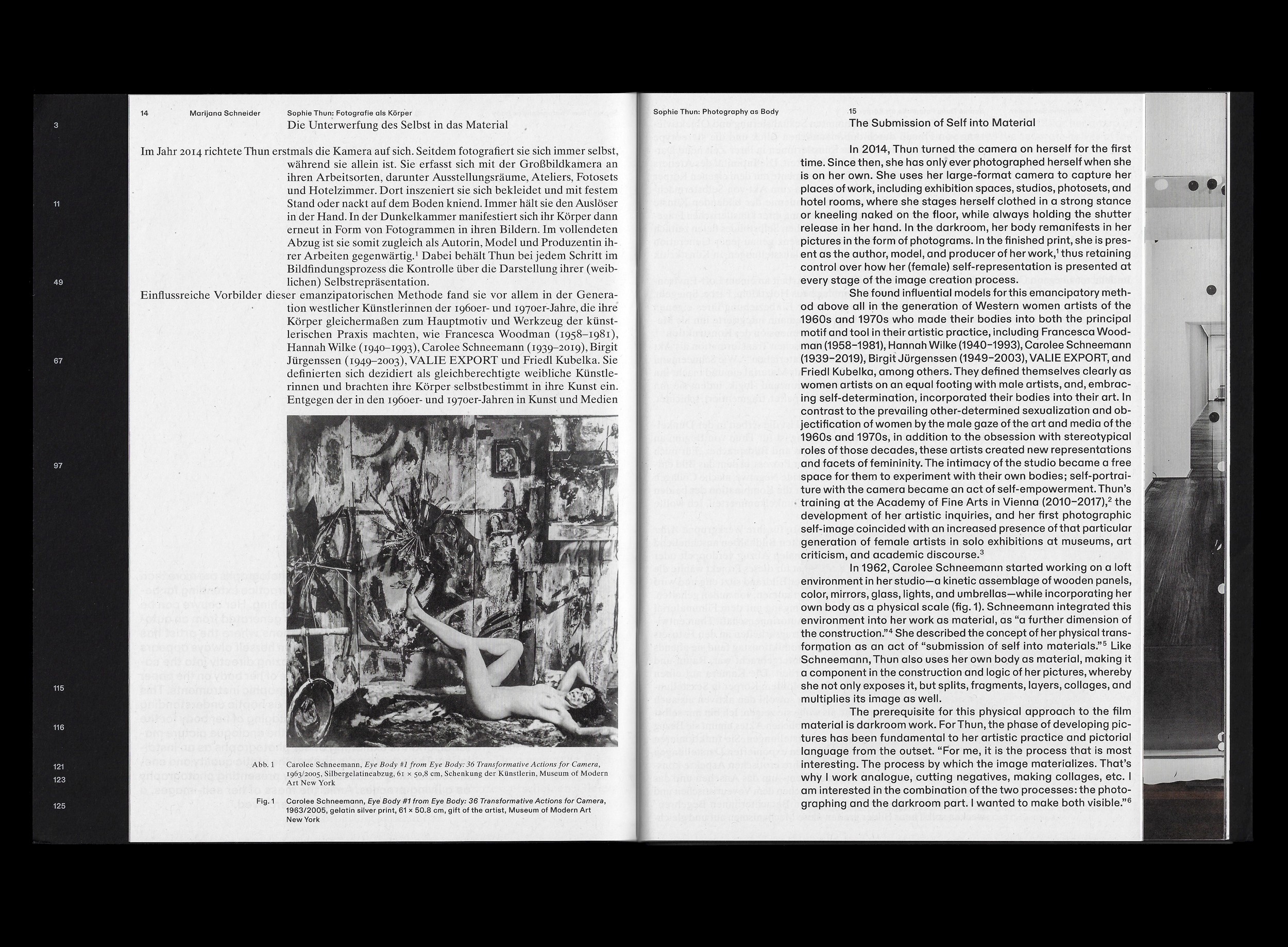
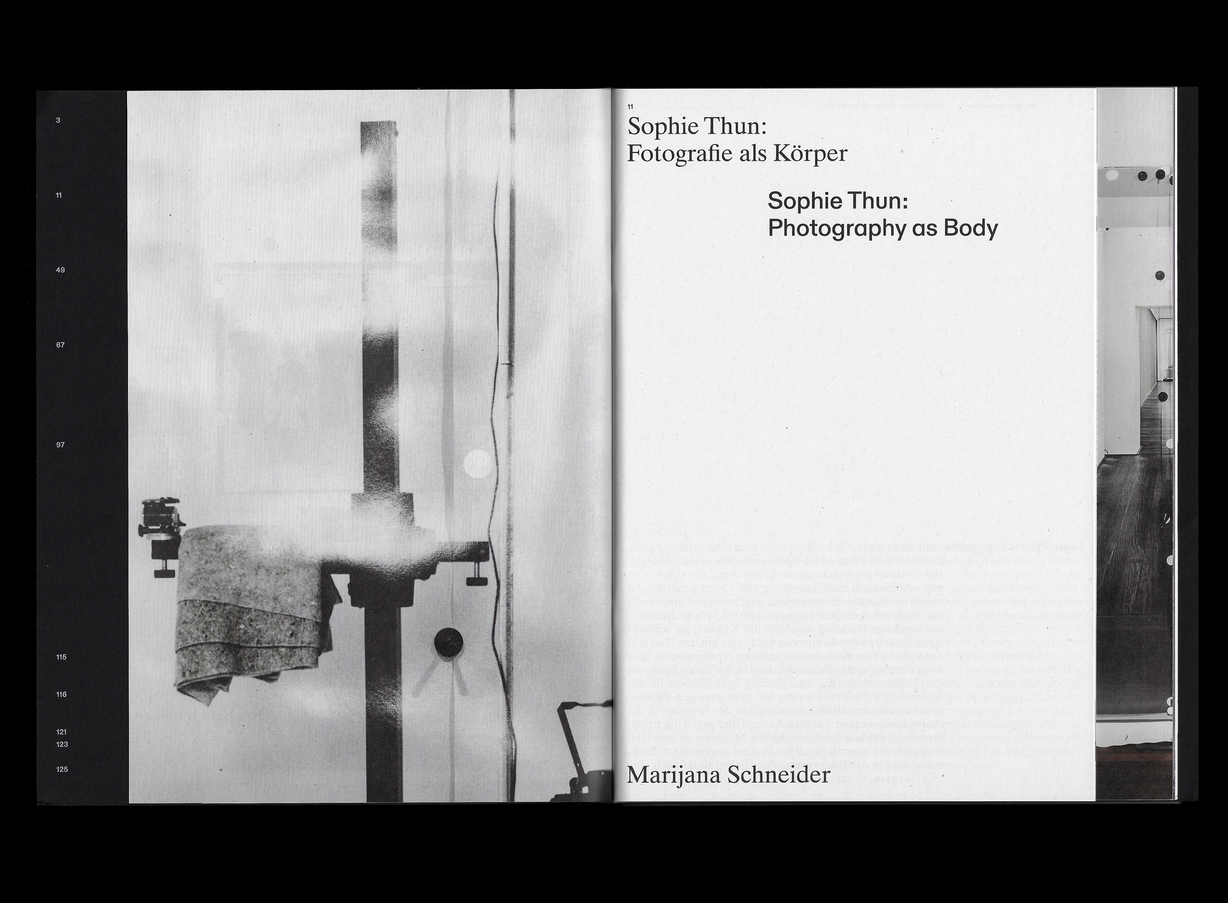
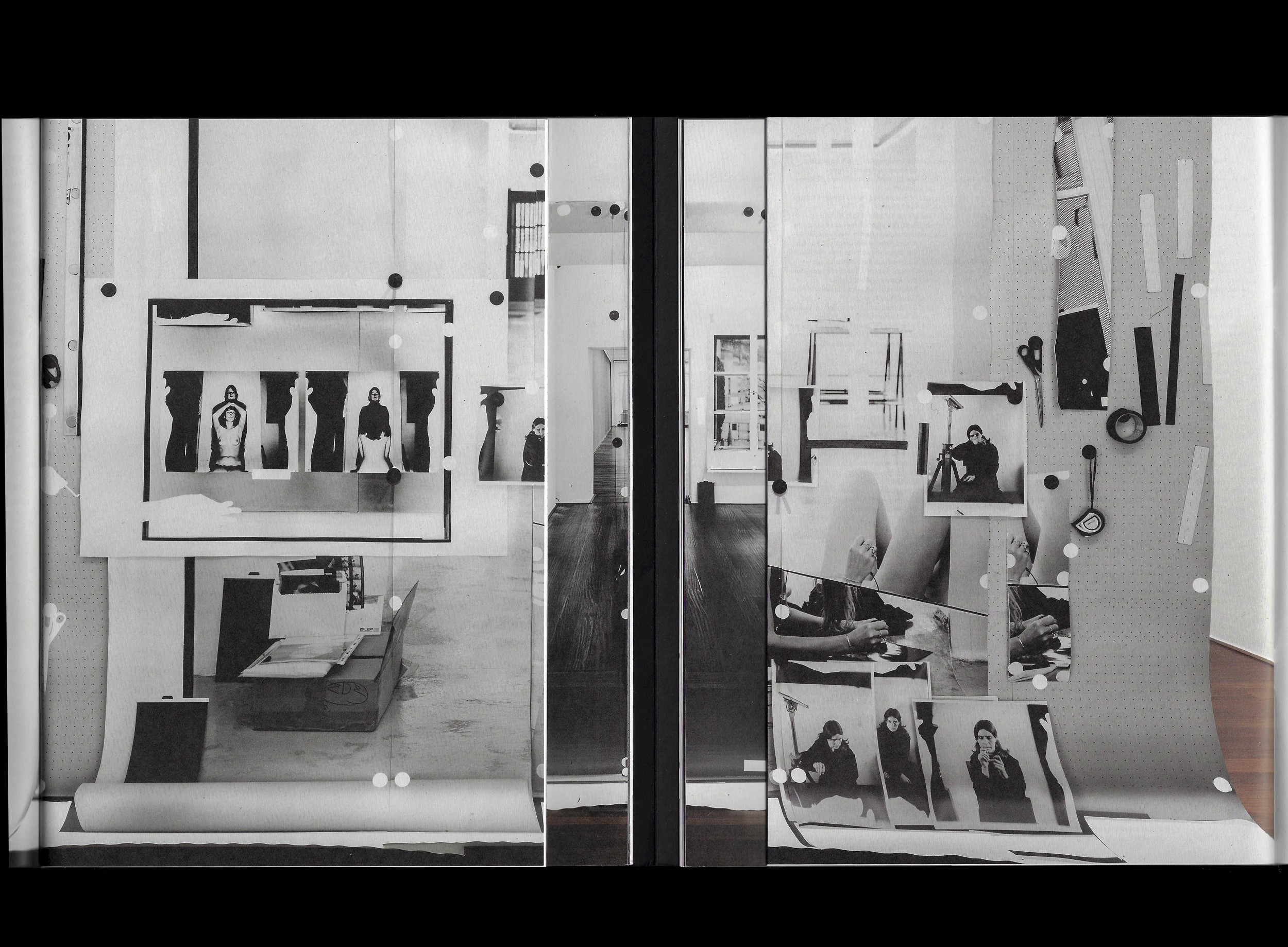
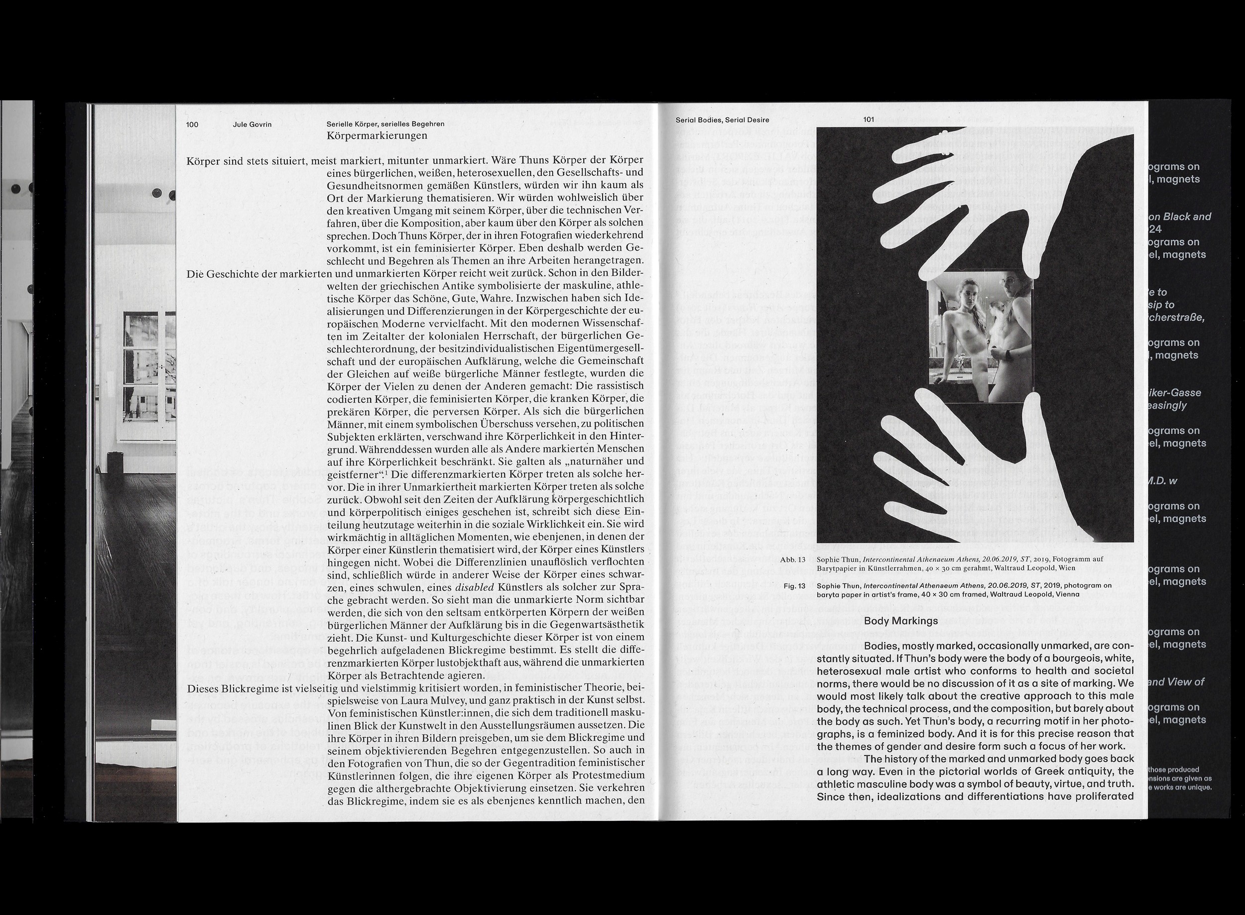
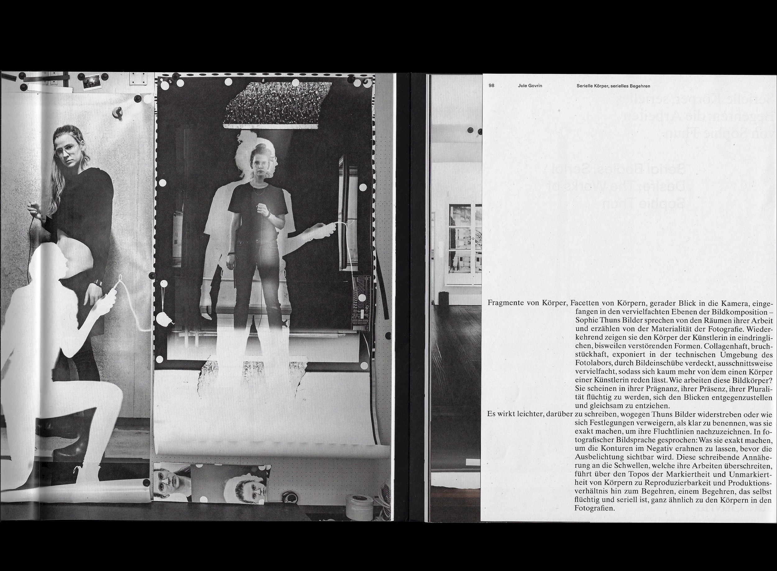
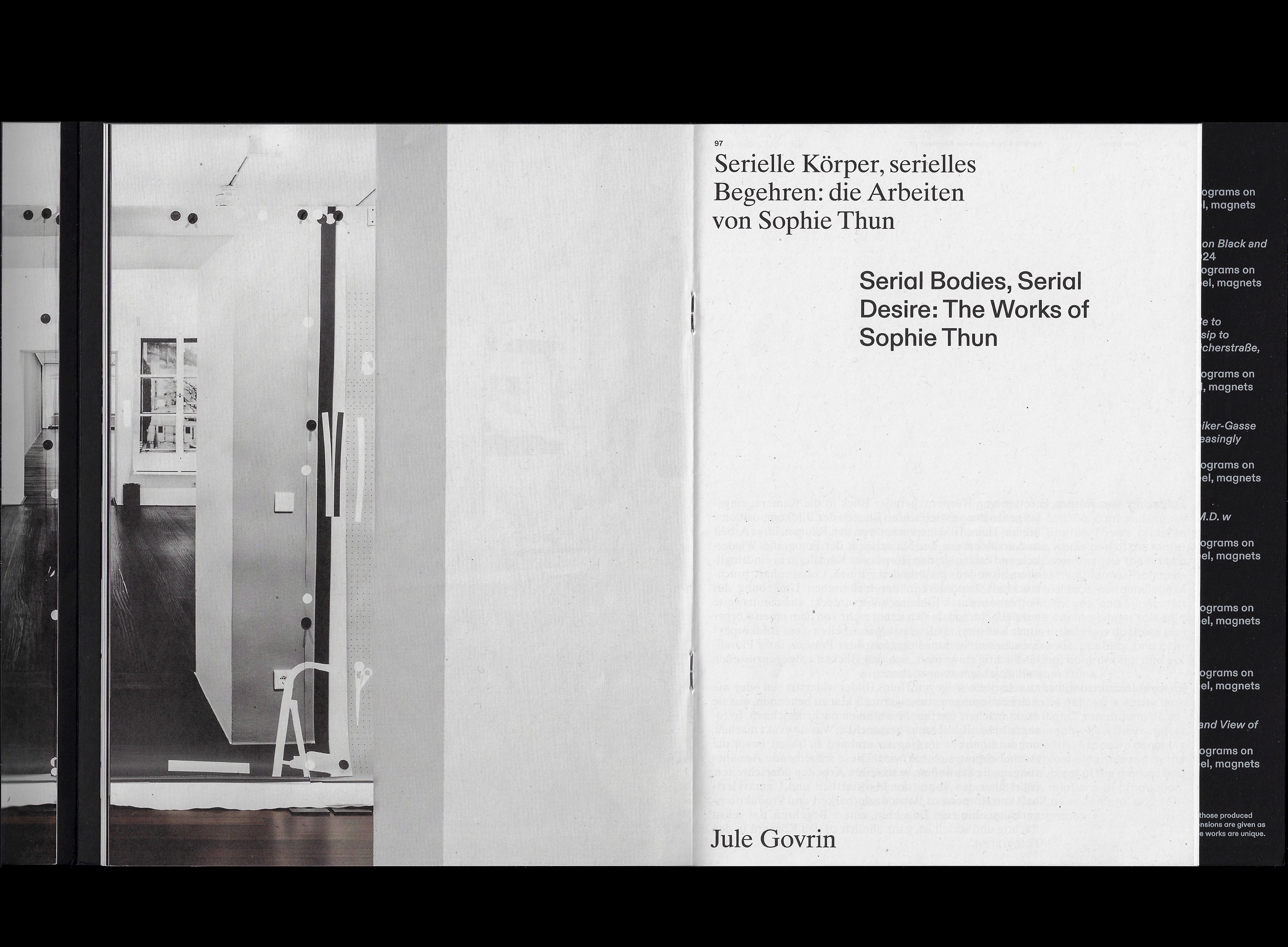
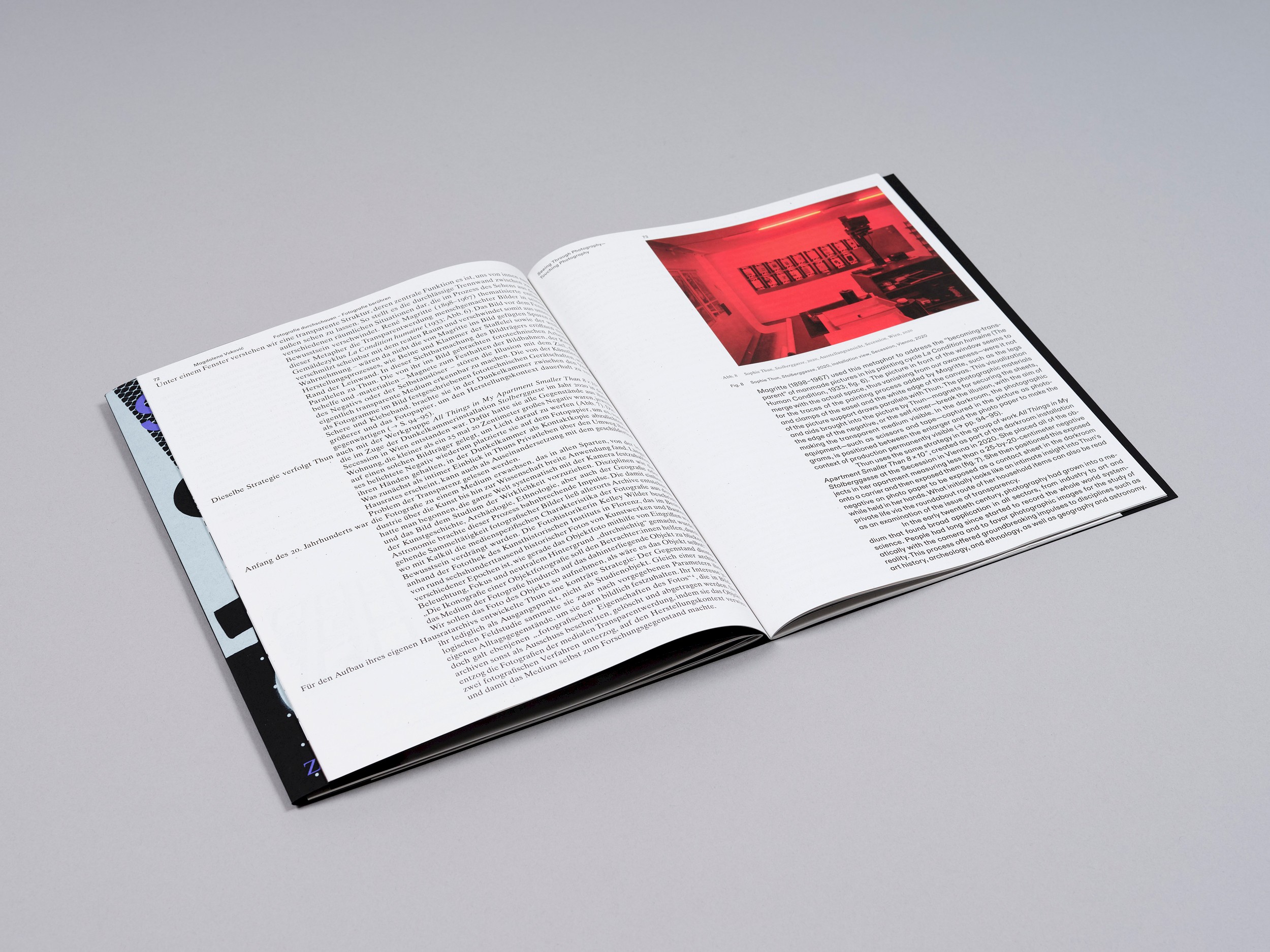
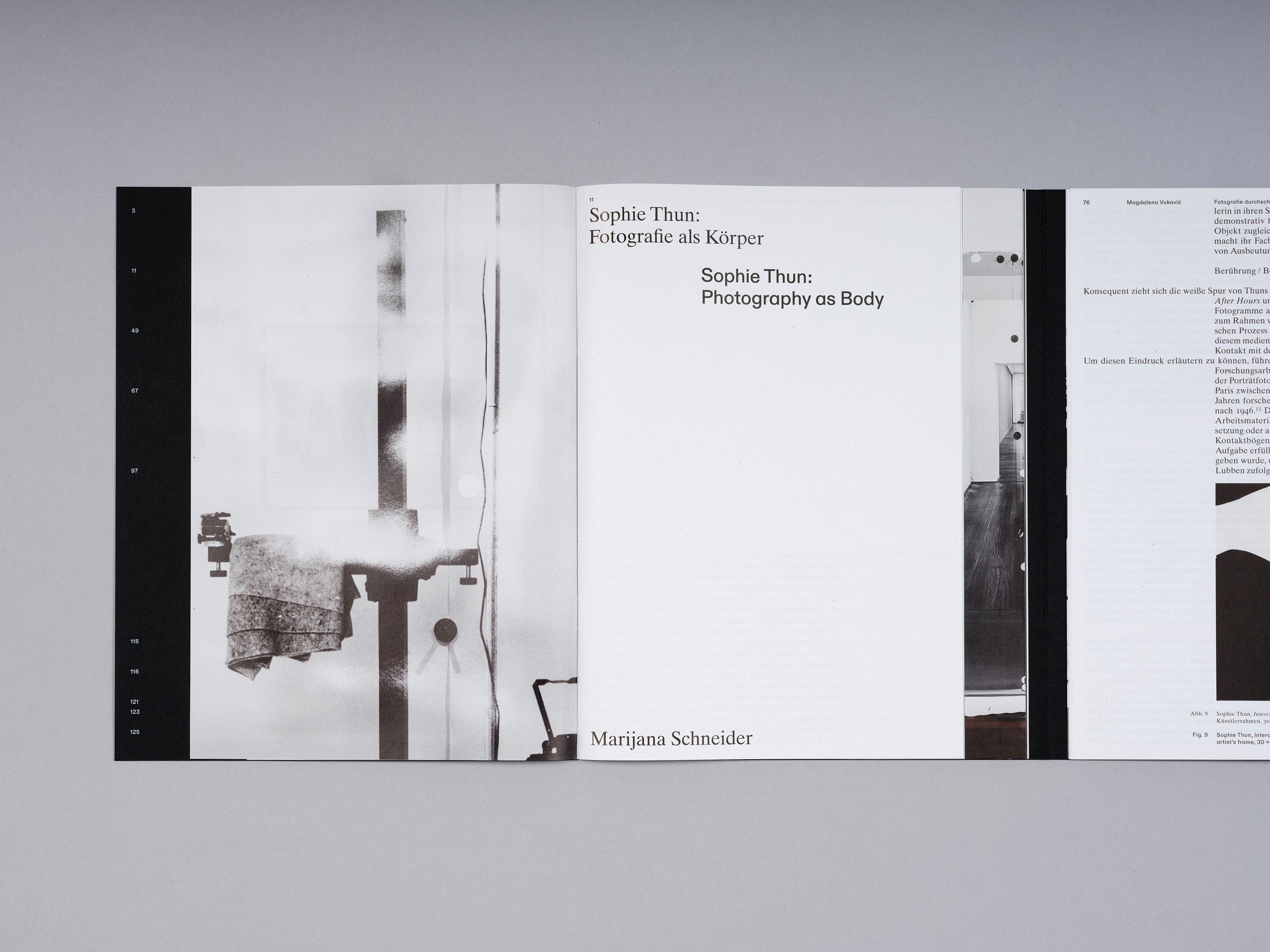
Sophie Thun’s photographic work resembles a stream of images of places and spaces in which the artist has worked and exhibited. She is always present in the image as the author of her analog photographs: at times she looks confidently into the camera, shutter release in hand; at others she is represented through her photographic apparatus. Through methods such as cutting, splitting, and multiplying, she presents identity as a process—mutable and in constant transformation. Her impressive spatial installations play with our perception of reality and representation.
The title of the exhibition, “Between Light and Wall,” refers to the light of the photographic enlarger, through which the negatives are projected onto the exposure wall.
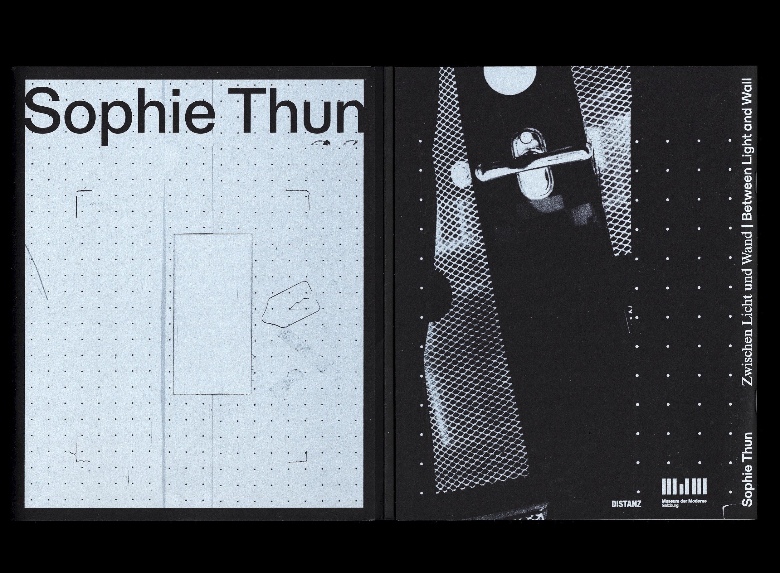
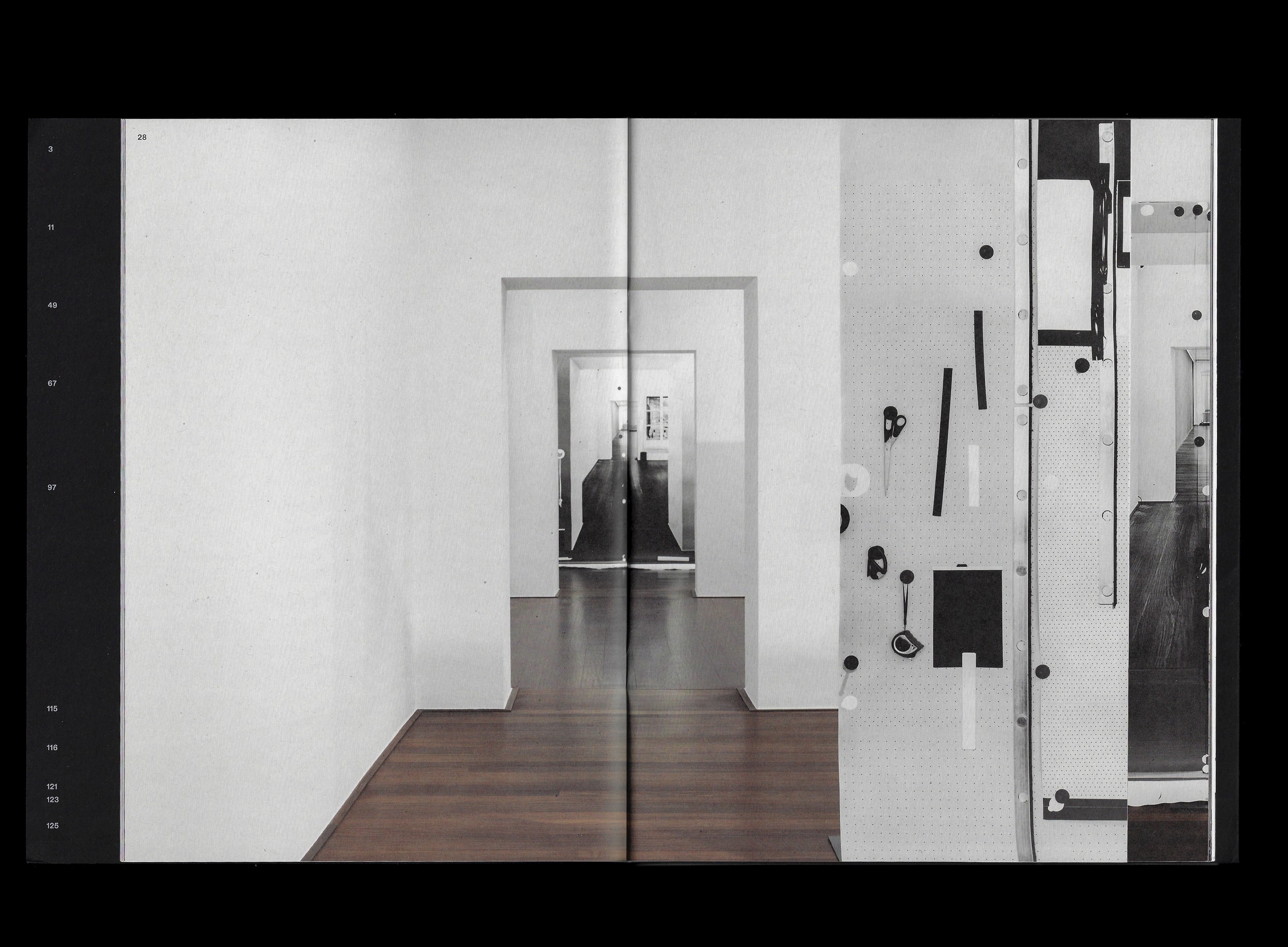
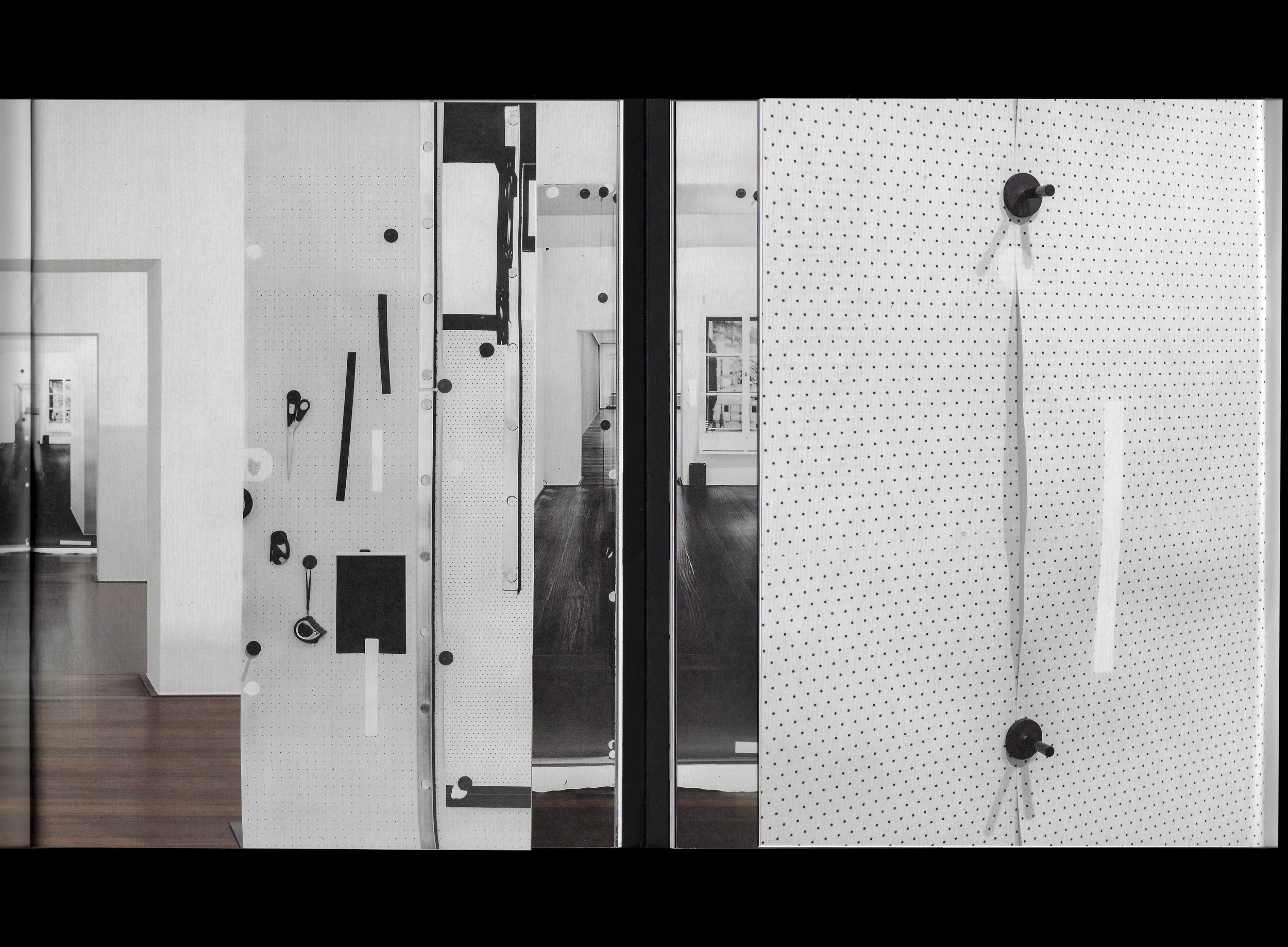
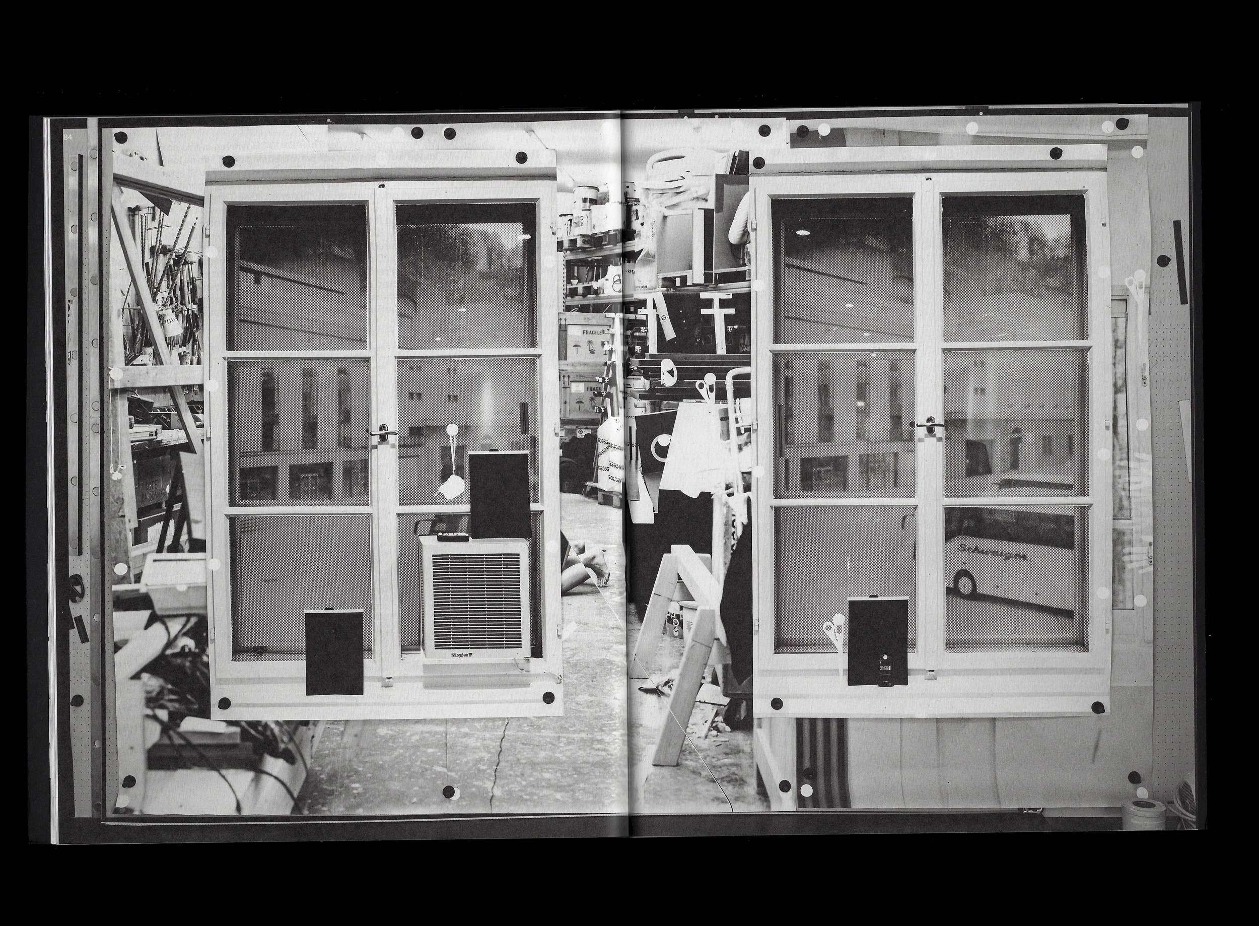
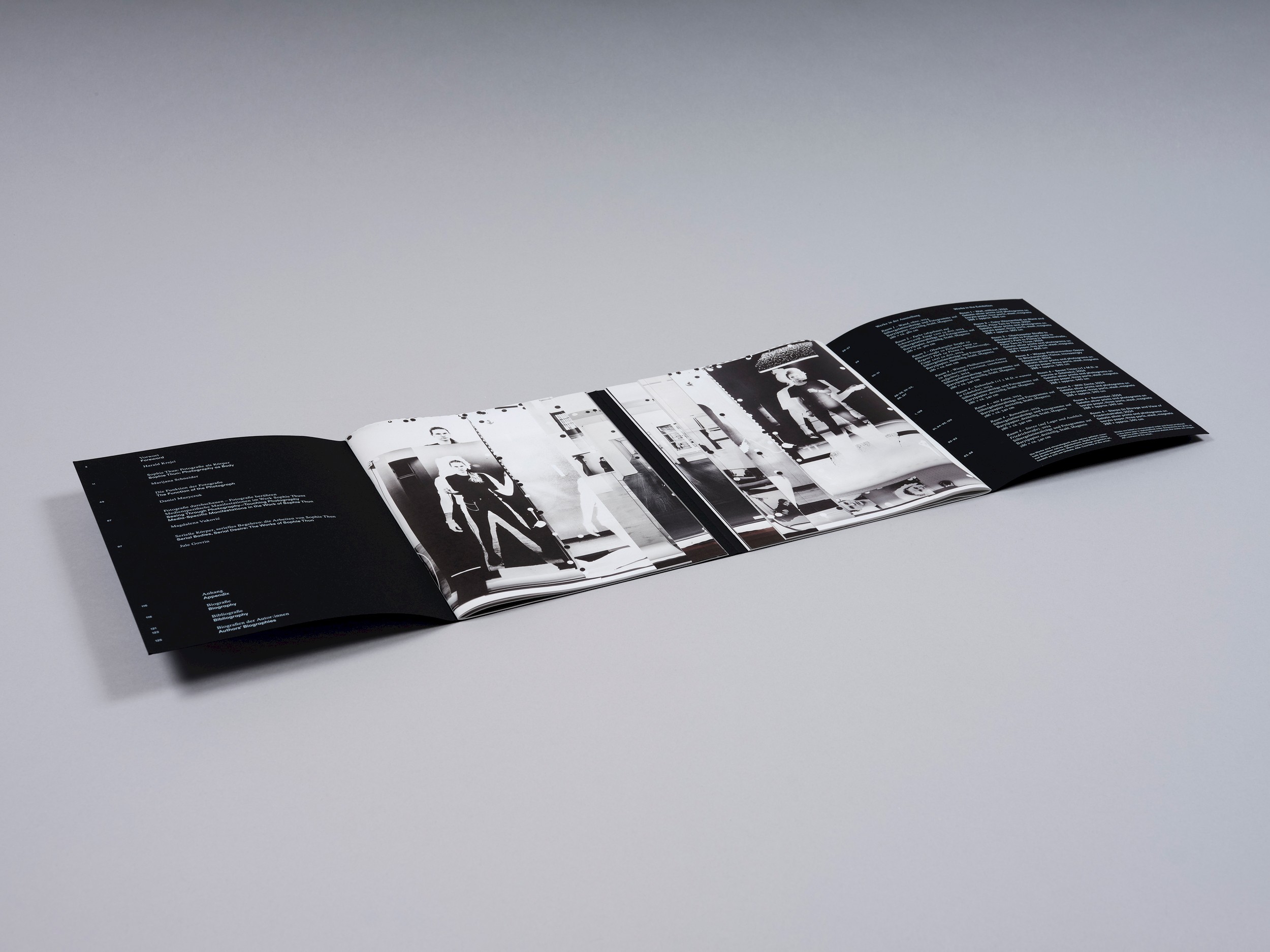
The exhibition functioned as a kind of retrospective, in which the artist presented a multilayered spatial installation. Thun incorporated the architecture of the exhibition space, which forms an enfilade—a sequence of four rooms through which one can see from the first room all the way to the last.
The concepts of density, layers, and planes were central to the book’s design concept, as was the perspectival characteristic of the enfilade.
The catalogue consists of two booklets that can be flipped through in parallel. The pages of both booklets are gradually shortened in steps, resulting in three different page formats that are mirrored left and right. The first page of each shortened section reveals a detail of the spatial installation. This creates a perspectival view that, like the architecture itself, extends through the successive rooms to the window of the final space.
As one flips through the pages, the viewer can visually immerse themselves step by step more deeply into the exhibition. In addition to browsing both booklets in parallel, it is also possible to hold the book and read it from beginning to end in a linear way.
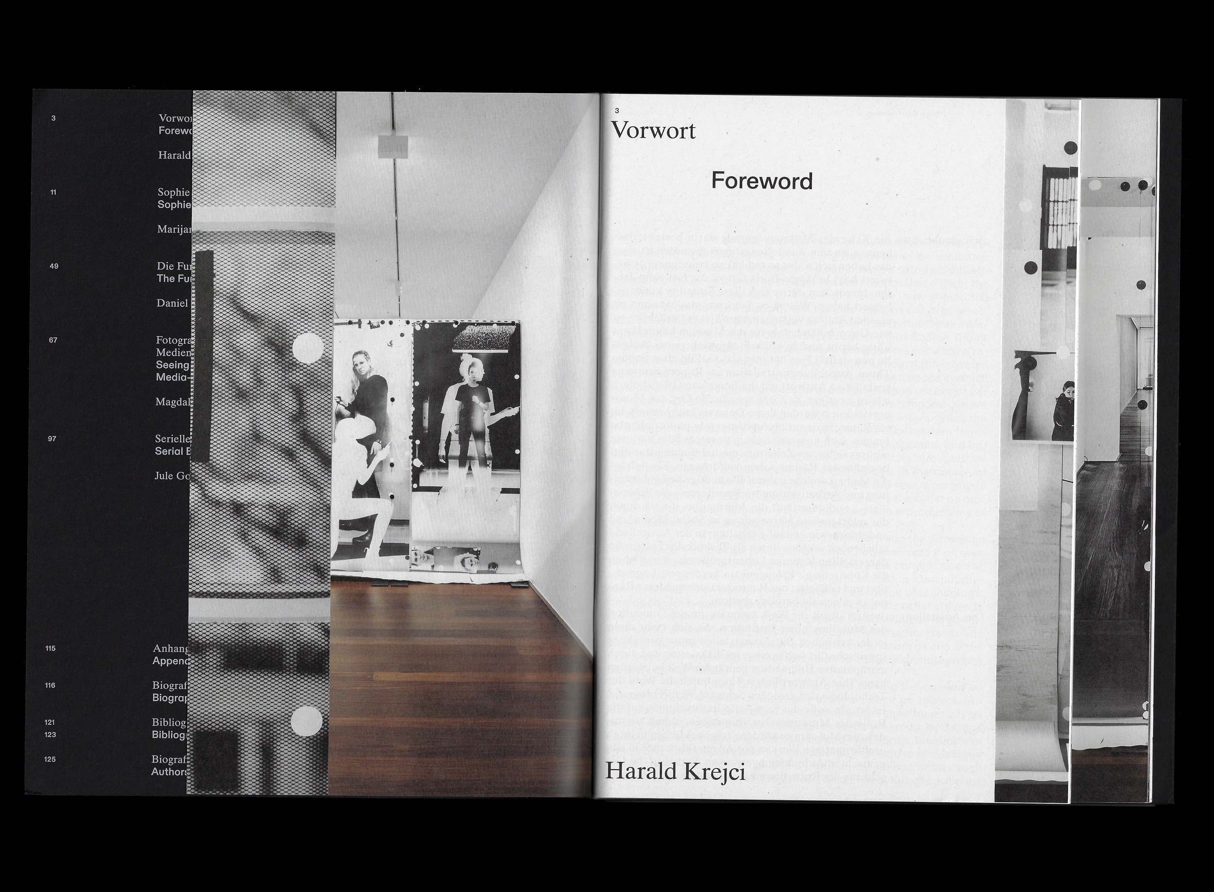
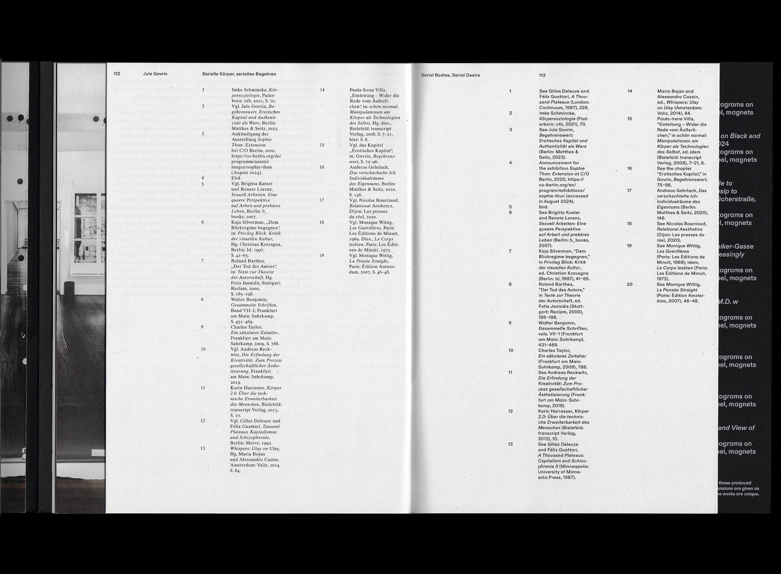
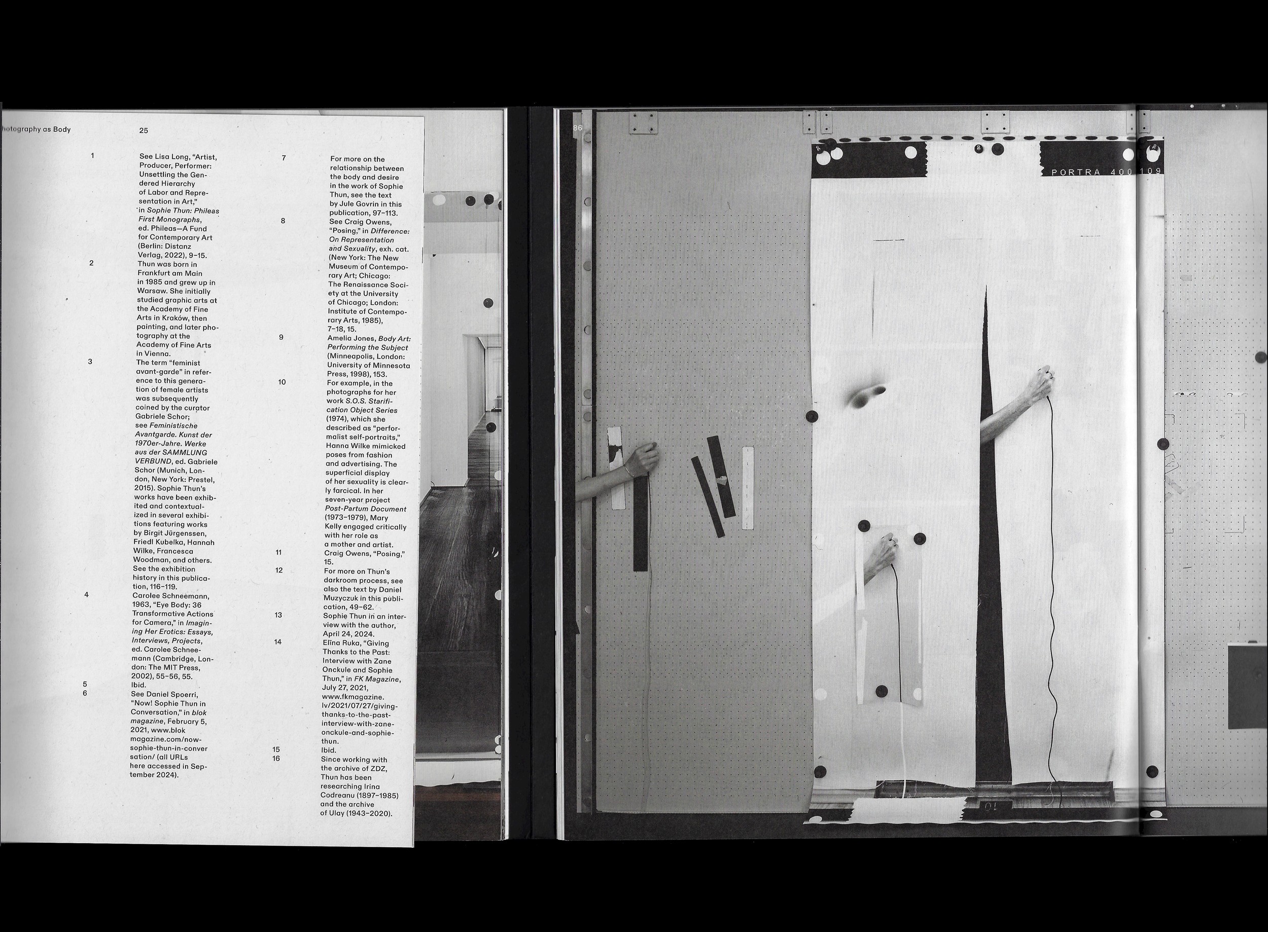
Typographically, a strong contrast emerges between the two languages in the catalogue. On each double-page spread, the German text runs on the left in Times Ten, while the English text appears on the right in the sans-serif typeface Diatype. There are four typographic hierarchies, which are also used perspectivally. The largest hierarchy appears at the beginning, while the footnotes set in 7pt are, spatially speaking, positioned further toward the back of the book.
In the German text, paragraphs are marked with outdents, while in the English text they are indicated by indents. This creates a negative–positive interplay between the two languages, reflecting Thun’s artistic practice between photogram and conventional exposure.
Through the three book formats, the column width of the text blocks gradually increases, resulting in different typographic points of view.
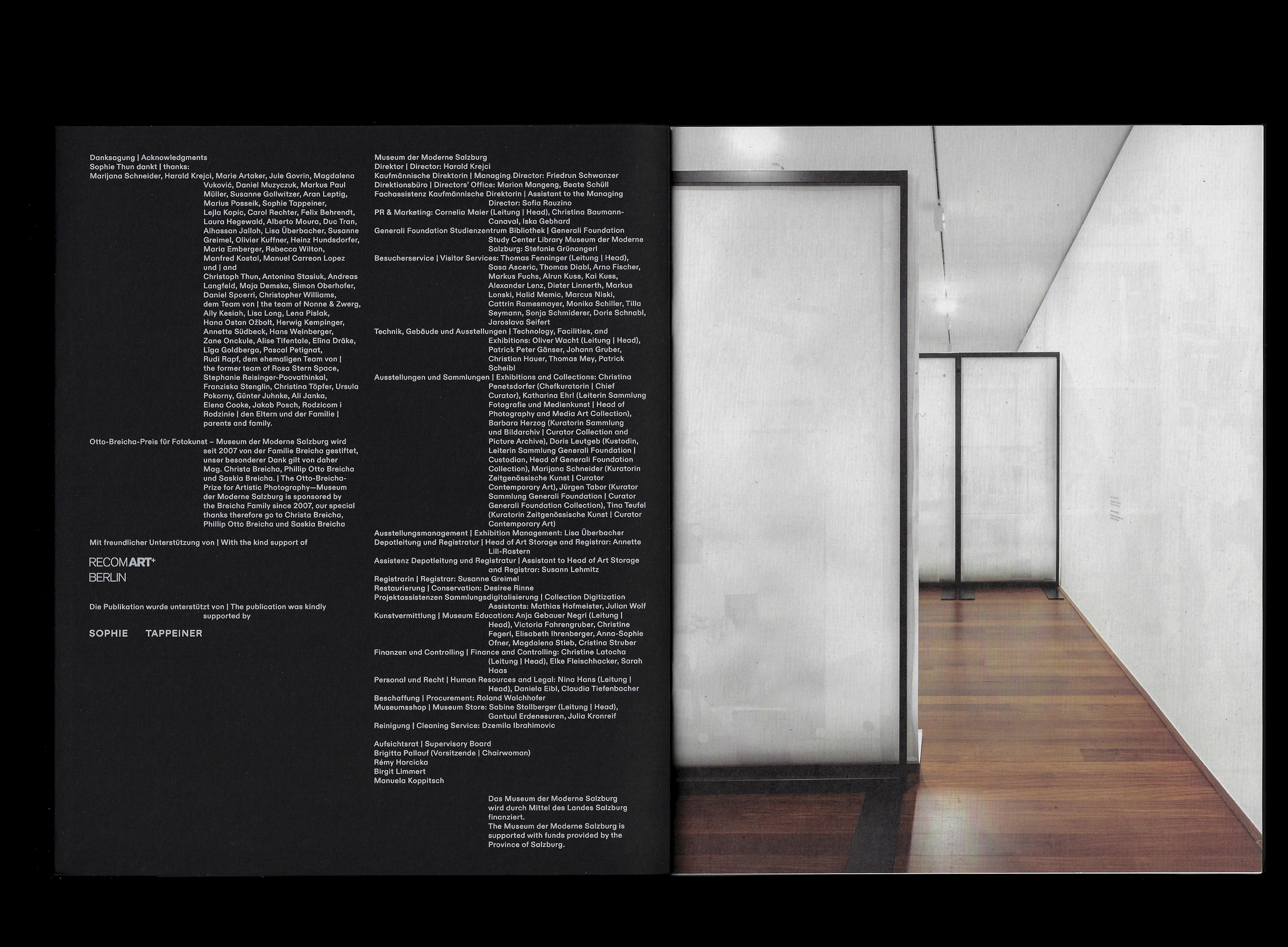
All papers are certified with the Blue Angel eco-label. Instead of cellophane wrapping, the museum copies were secured with a banderole made from printer’s waste sheets. Exhibition photography by Kunst-Dokumentation.
Book scans by Rok Ifko Krajnc
Studio photography by Michael Goldgruber
✷ One of The Most Beautiful Austrian Books 2024
✷ Order book