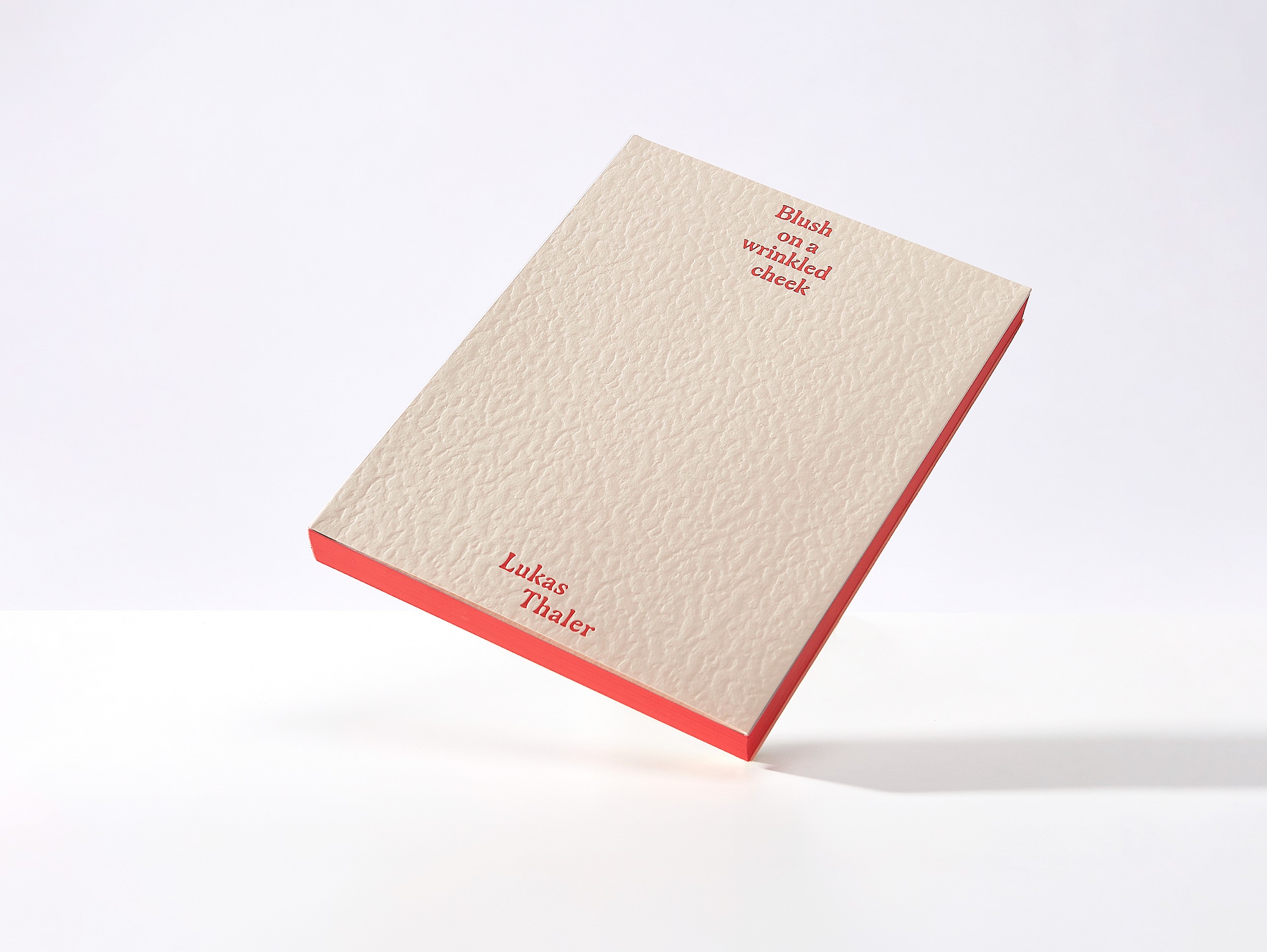
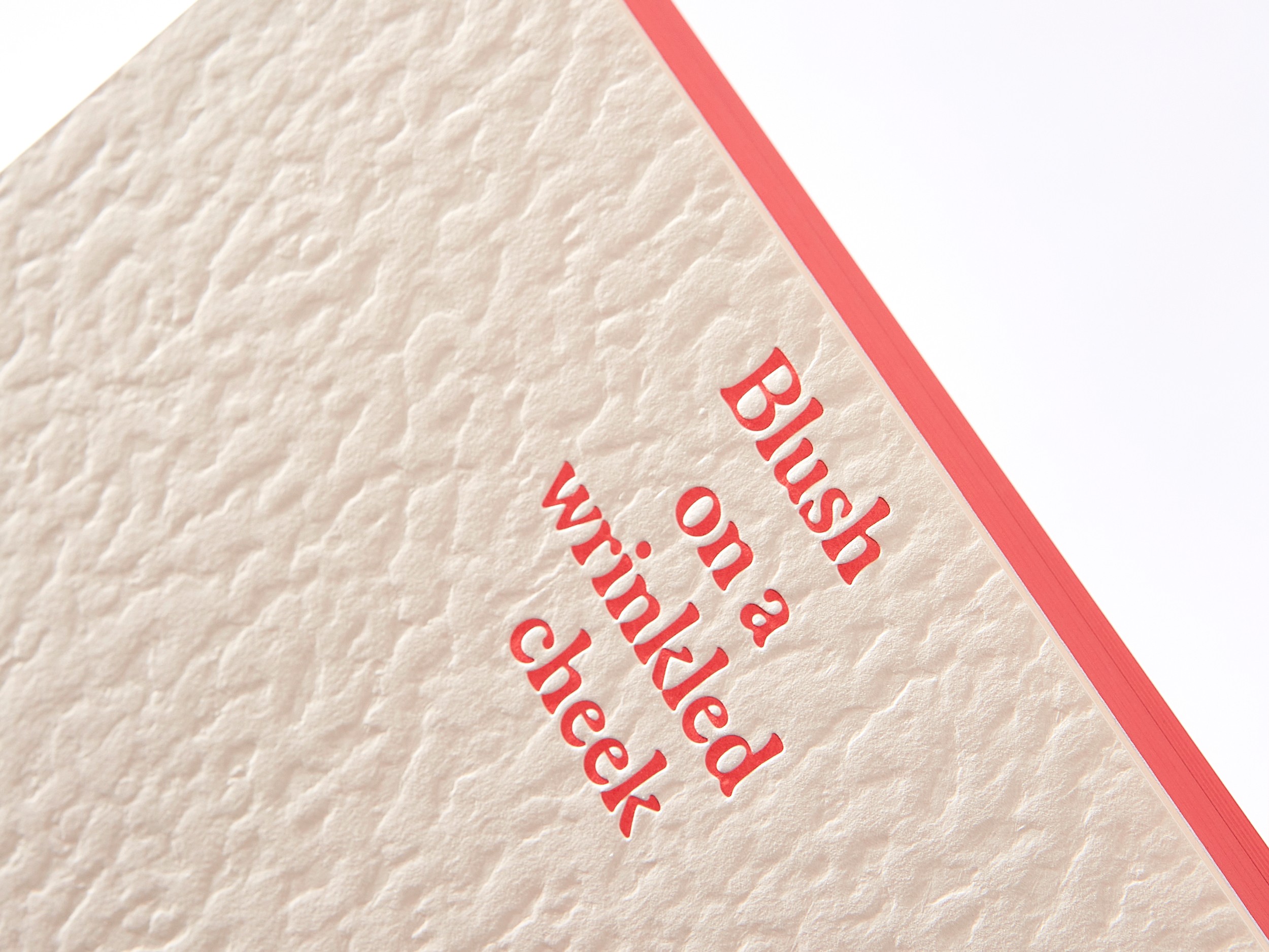
Lukas Thaler. Blush on a wrinkled cheek
- Editor(s): Lukas Thaler
- Publisher: formerlynotknown-press
- Year: 2025
- Size: 26.5 × 20 cm
“This book is an exhibition. Instead of physical walls or built architecture, ist pages become the space.” Within it, a selection of works from eighteen series created over the last ten years of Lukas Thaler’s oeuvre is situated.
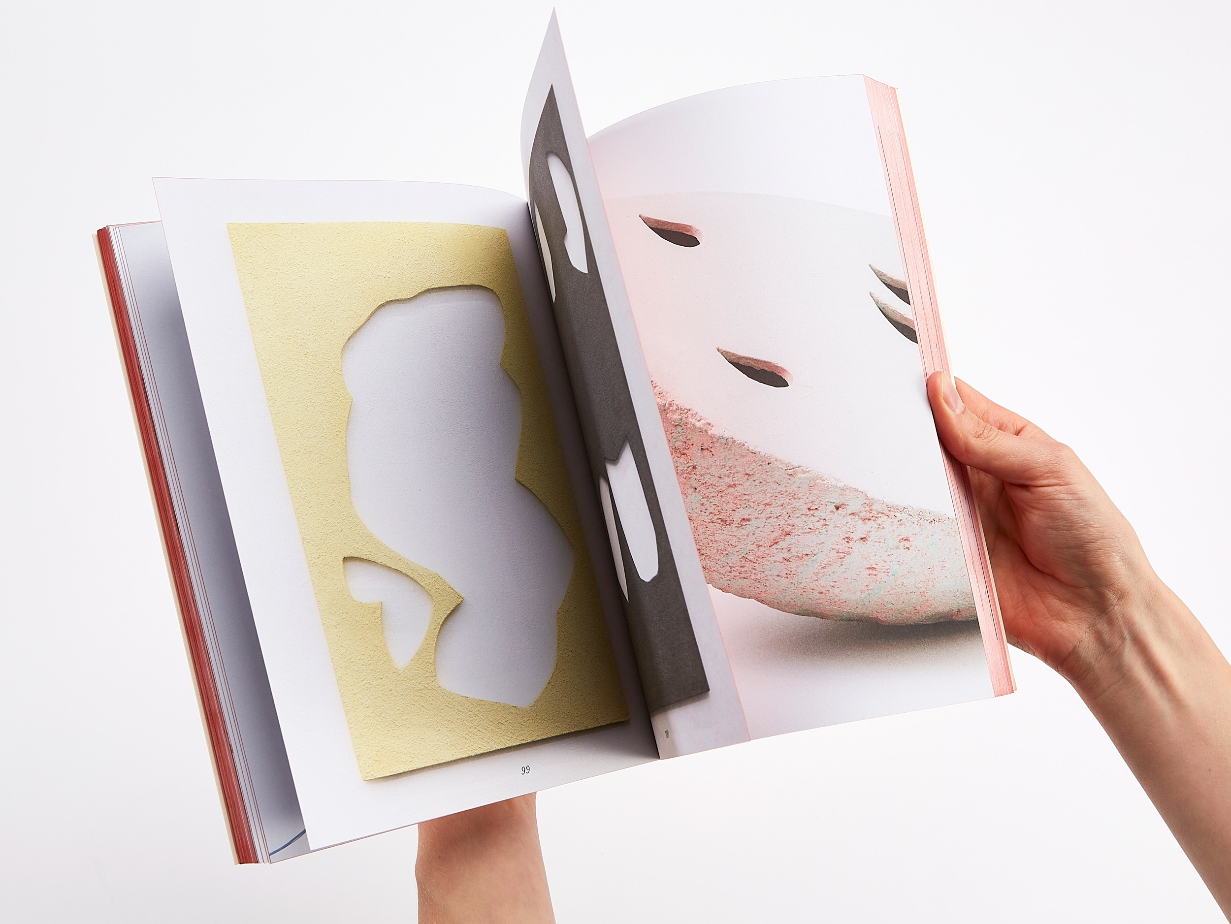
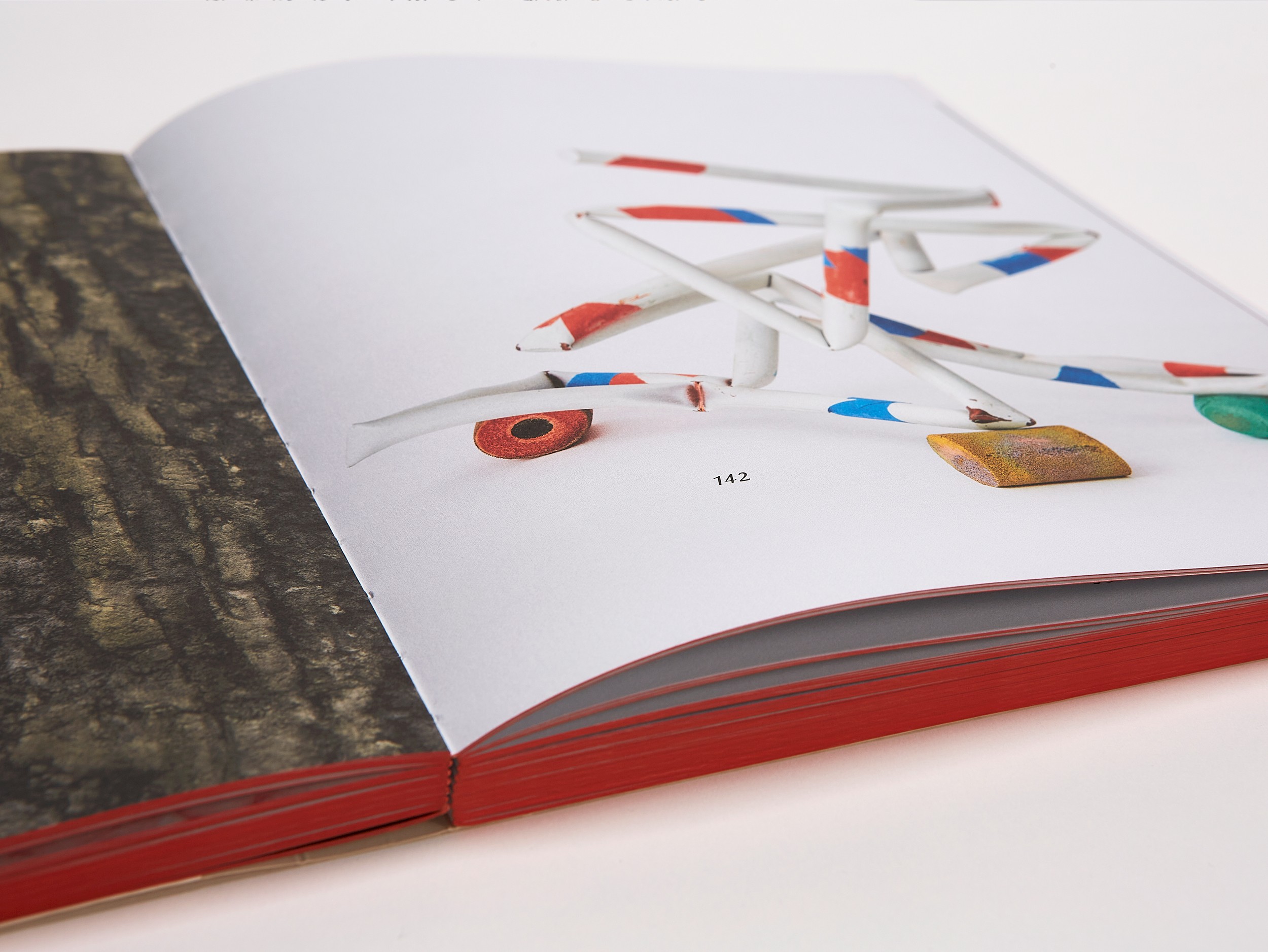
When objects encounter one another, something new emerges between them. A quiet conversation, a mutable presence that eludes definition. Our gazes meander through the space, circling the objects. The small appears monumental; the large seems as though it could rest on the palm of a hand.
The selection presented in this artist’s book understands itself as an incomplete encyclopedia that follows no chronology, as a vitrine or as a bestiary.
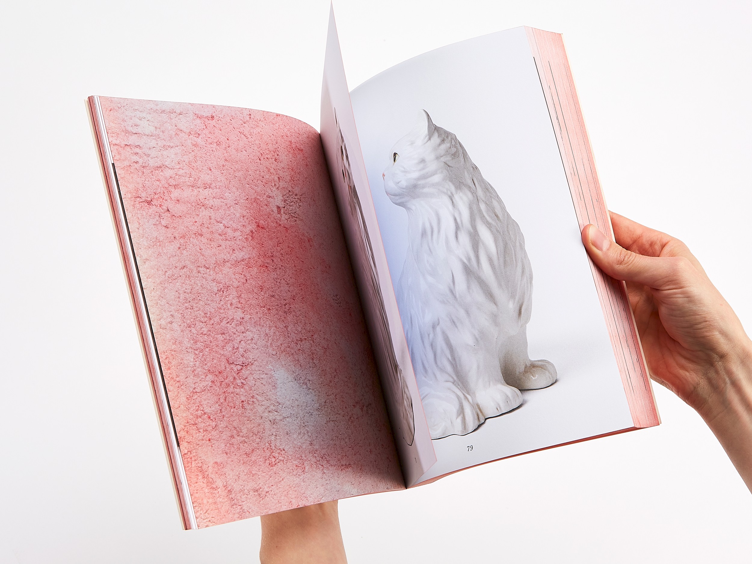
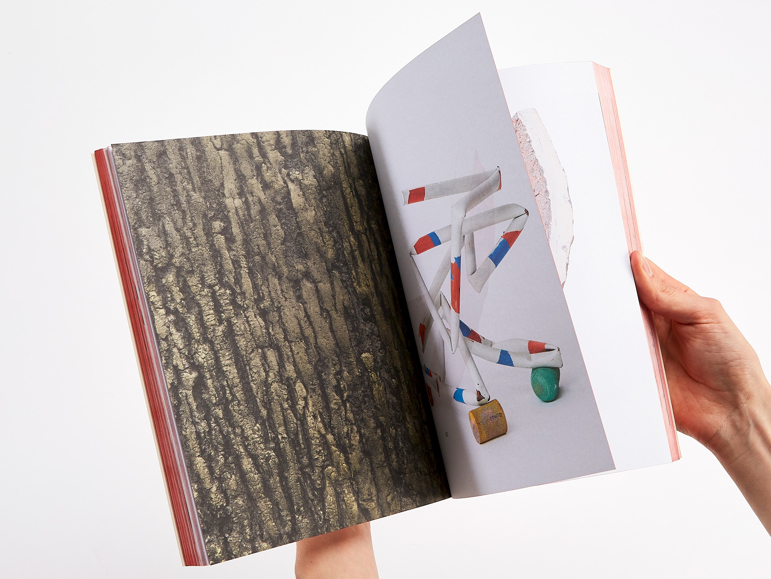
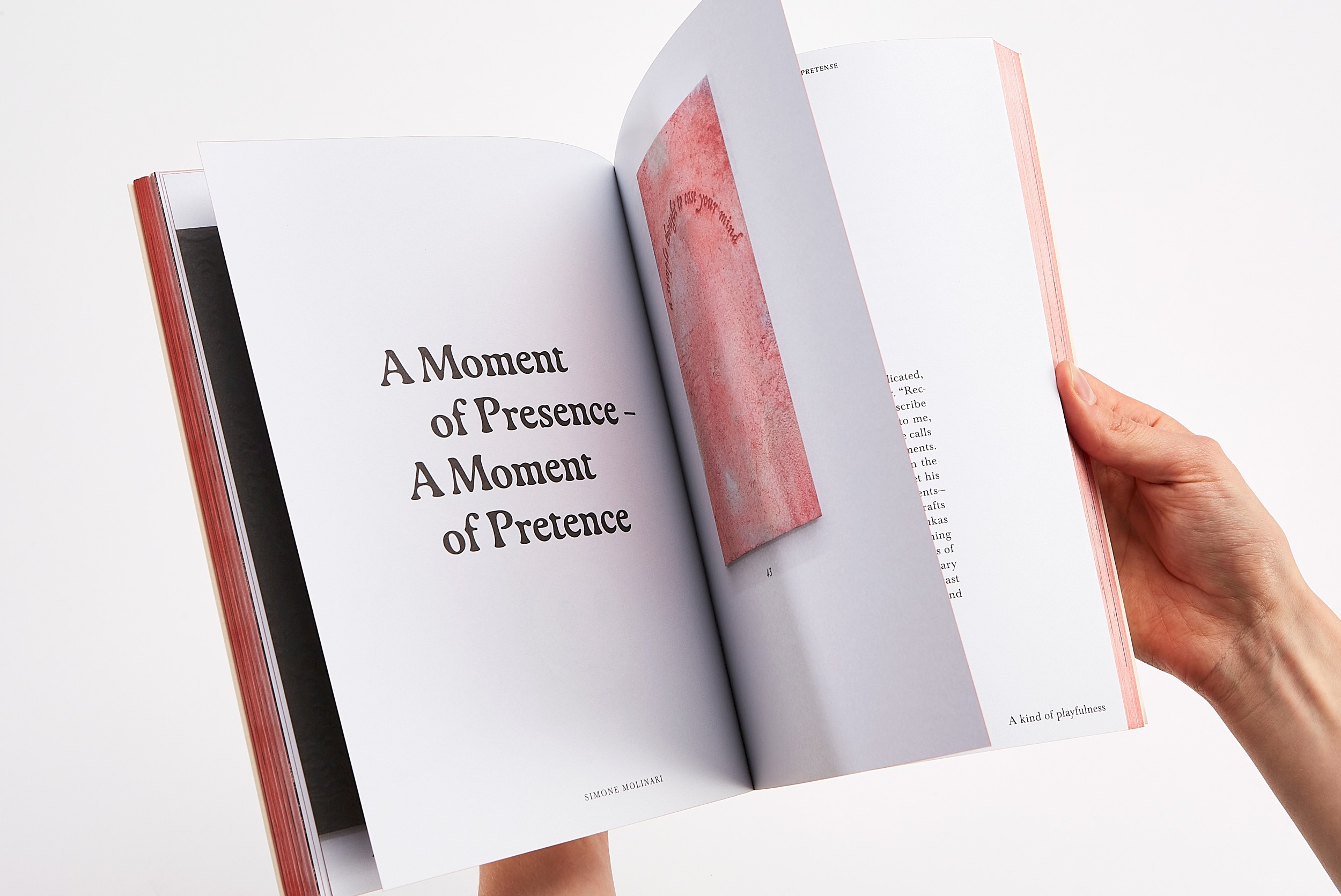
In the book’s core, no paper color is visible. All elements (objects and texts) appear against the background of a white exhibition wall in an undefined space. The bilingual texts weave their way through the exhibition, printed on a rough, uncoated paper.
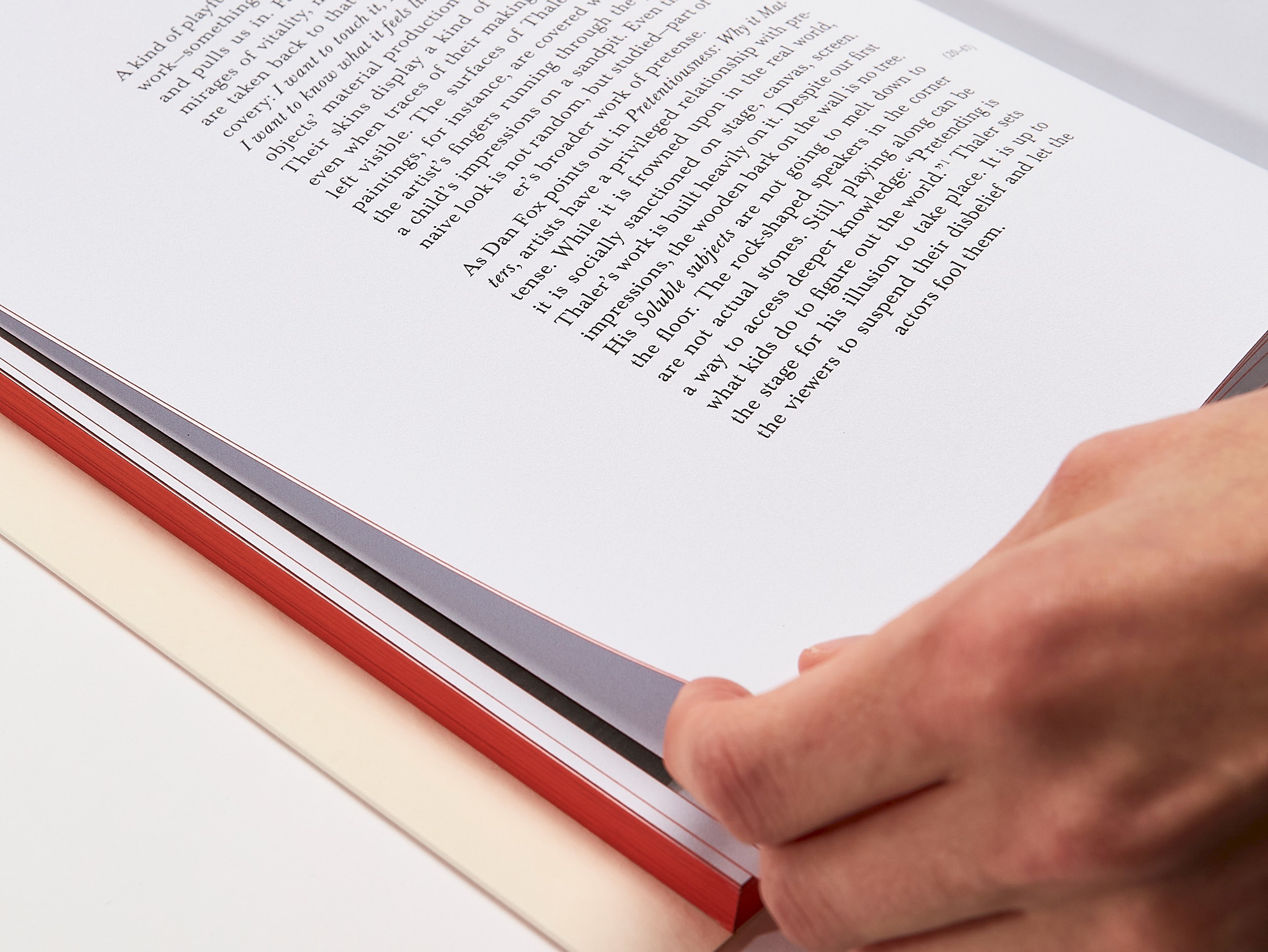
The typeface Gaya appears as if it were dripping, similar to Lukas Thaler’s multilayered, three-dimensional paintings. The body text is set in the classic book typeface Baskerville. Column width and height refer to the Penguin paperback format (111 × 118 mm), which Thaler often uses as a starting point for his canvases.
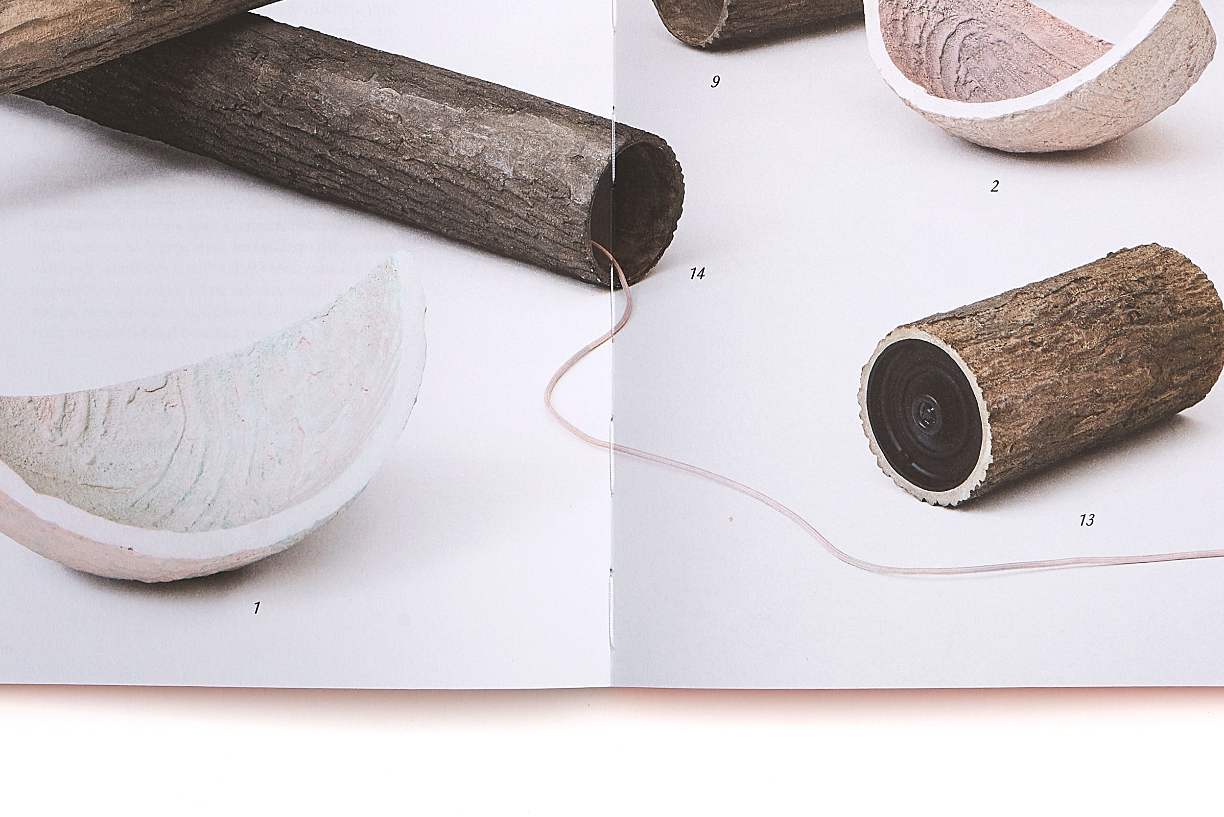
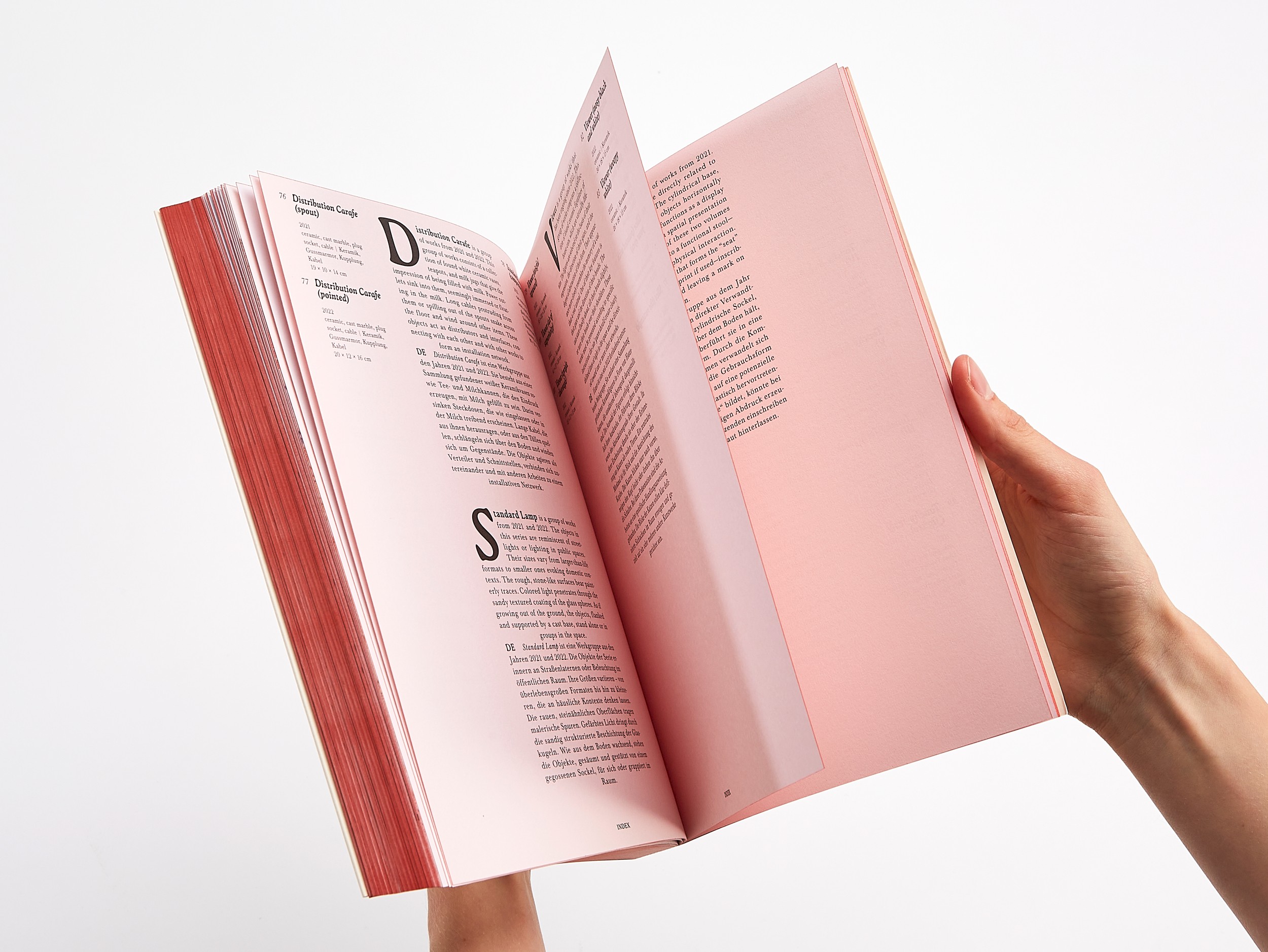
As the texts run between the sequences of images, each text page carries a so-called catchword in the lower right corner—sometimes consisting of several words—which points to the next text passage. Before the invention of page numbers, this typographic element was frequently used in early book printing (15th–18th centuries) so that bookbinders could immediately recognize the correct order of the pages. Since in the book Blush on a wrinkled cheek all objects are numbered, page numbers have been omitted. All objects can be found in the index at the end of the book.
Beyond their navigational function, the catchwords form an independent poetic layer within the book. Individual terms removed from their context are also a frequently used element in Thaler’s works, such as: “the same, the same,” “every day,” or “this is highly inaccurate.”
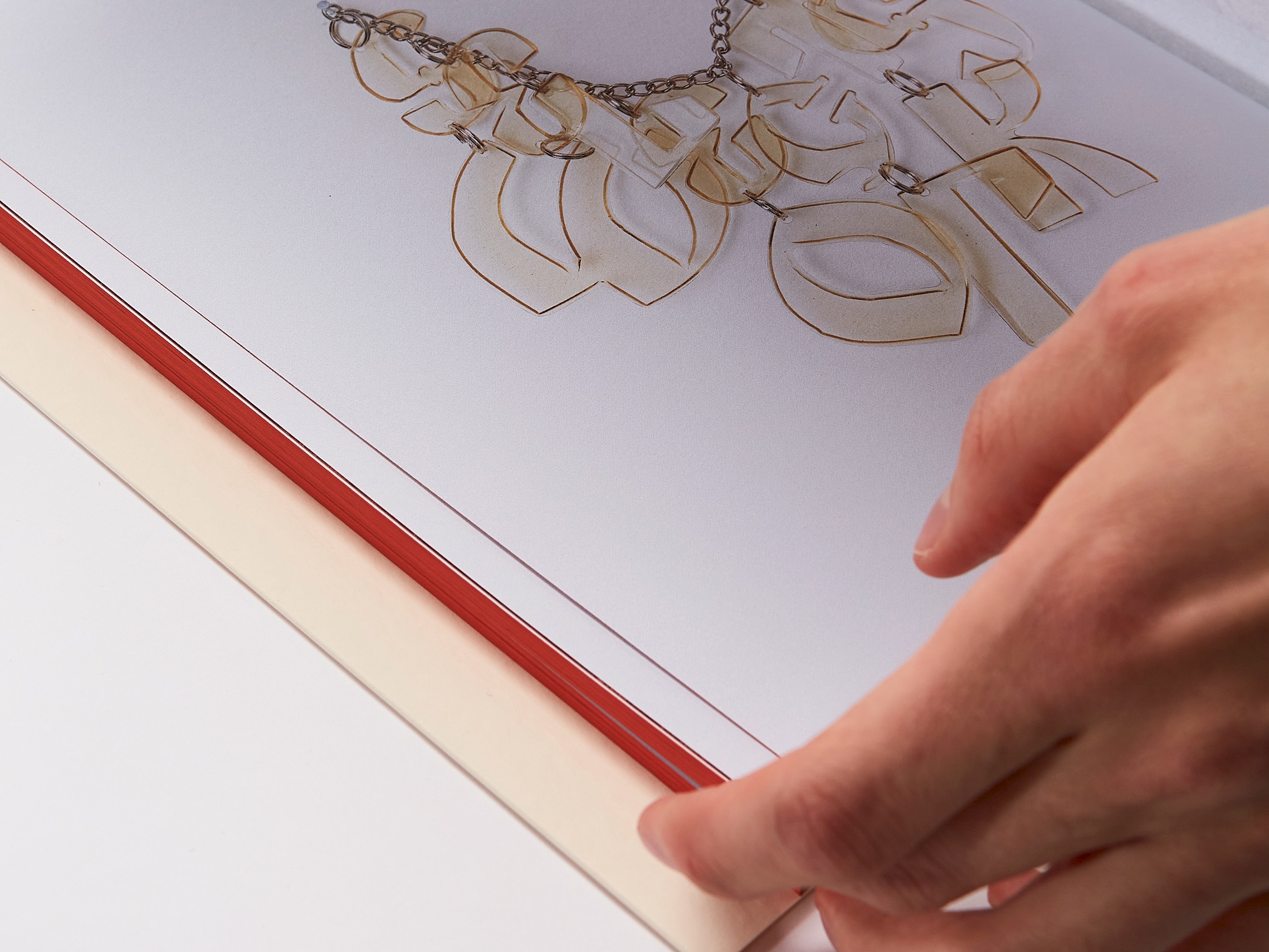
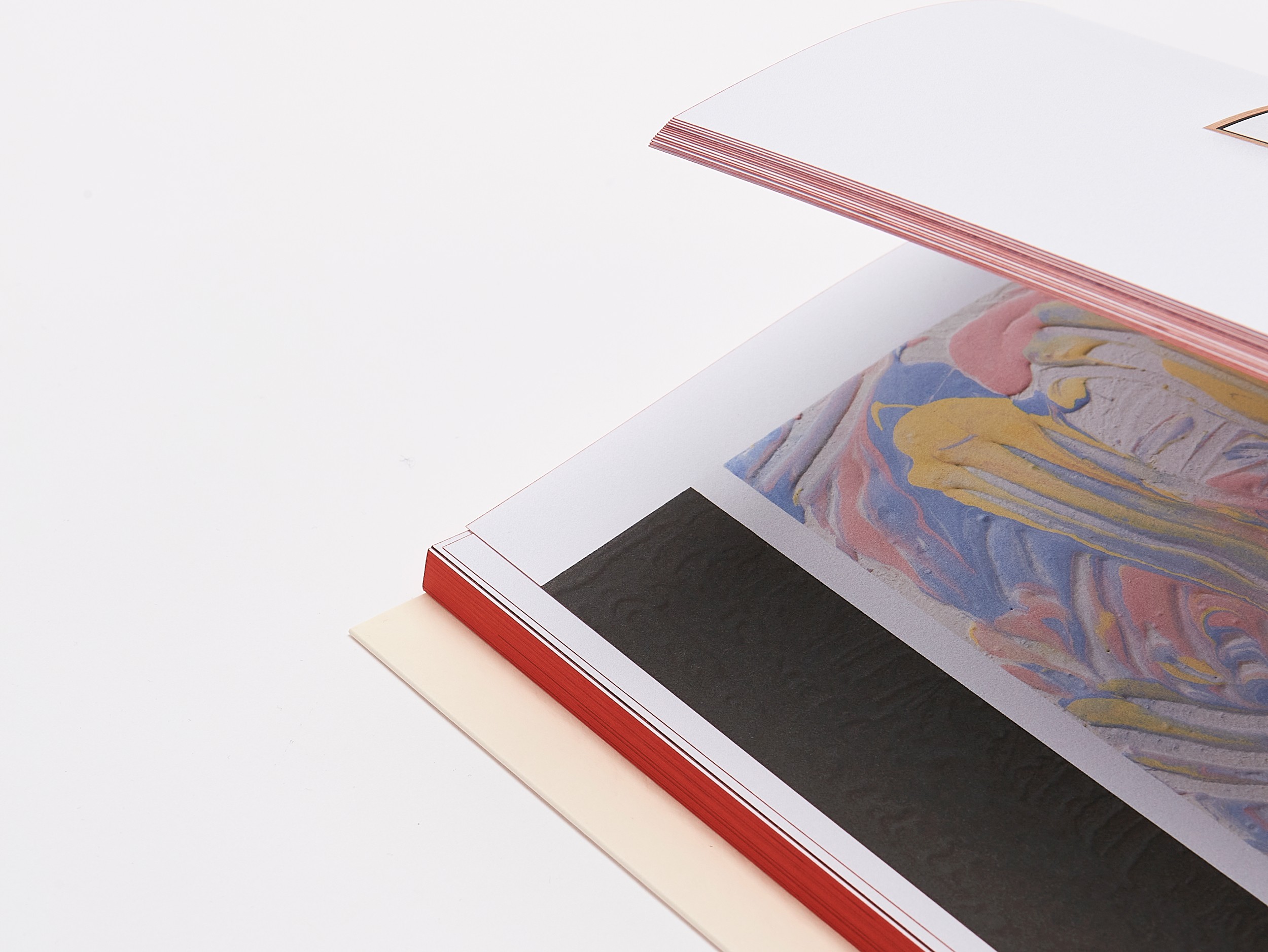
The red fore-edge refers to the glow or radiance of Thaler’s works. Depending on how the pages are fanned, the hue shifts; similarly, the intensity of the red tone on the index pages varies in subtle ways.
Lukas Thaler’s works emerge through an iterative process that involves material experimentation, variation, sequence, and repetition. Manual gestures encounter digital traces; the abstract merges with the concrete, and the objects assume various roles as independent characters.
Studio photography by Gregor Titze