Gerti Machacek. Jewellery Sculpture
Schmuckskulptur
- Editor(s): Gerti Machacek
- Publisher: arnoldsche
- Year: 2023
- Size: 24,2 x 29,7 cm
- Number of pages: 280
Designed in collaboration with Alexandra Möllner.
The monograph provides a comprehensive insight into the work of the Austrian jewellery artist, Gerti Machacek.
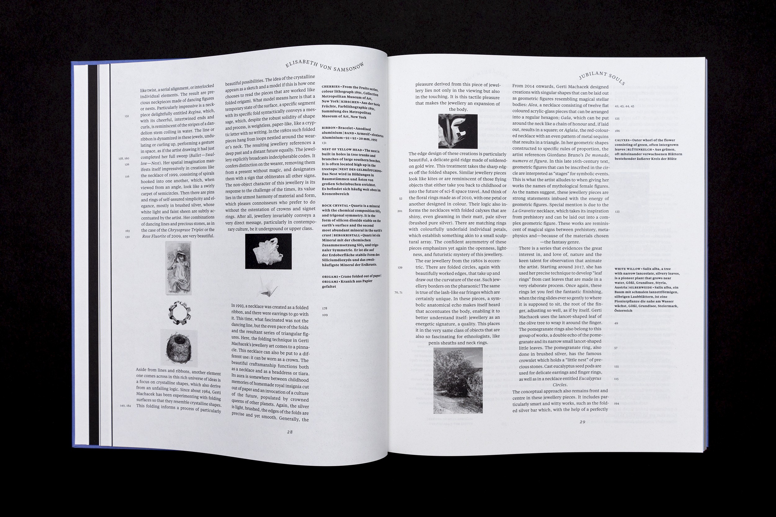
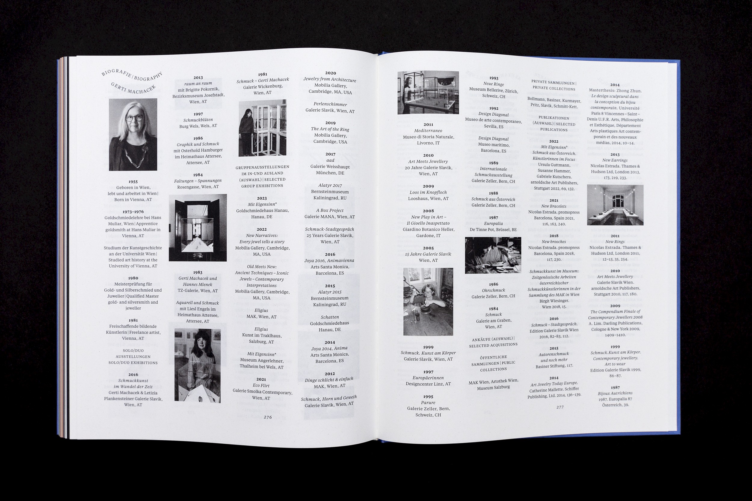
Her jewellery is strongly oriented towards the body, movement and changing perspectives. Her ideas intertwine figurative architectural unfoldings with multi-layered humour. Essays by the art historian Anne-Katrin Rossberg, the artist and philosopher Elisabeth von Samsonow and the writers Beatrix Kramlovsky and Lydia Mischkulnig provide a personal approach to Machacek’s work.
The starting point for the design were the various tensions that become effective in Machacek’s work: Between applied and fine art, art and humour, sculpture and movement.
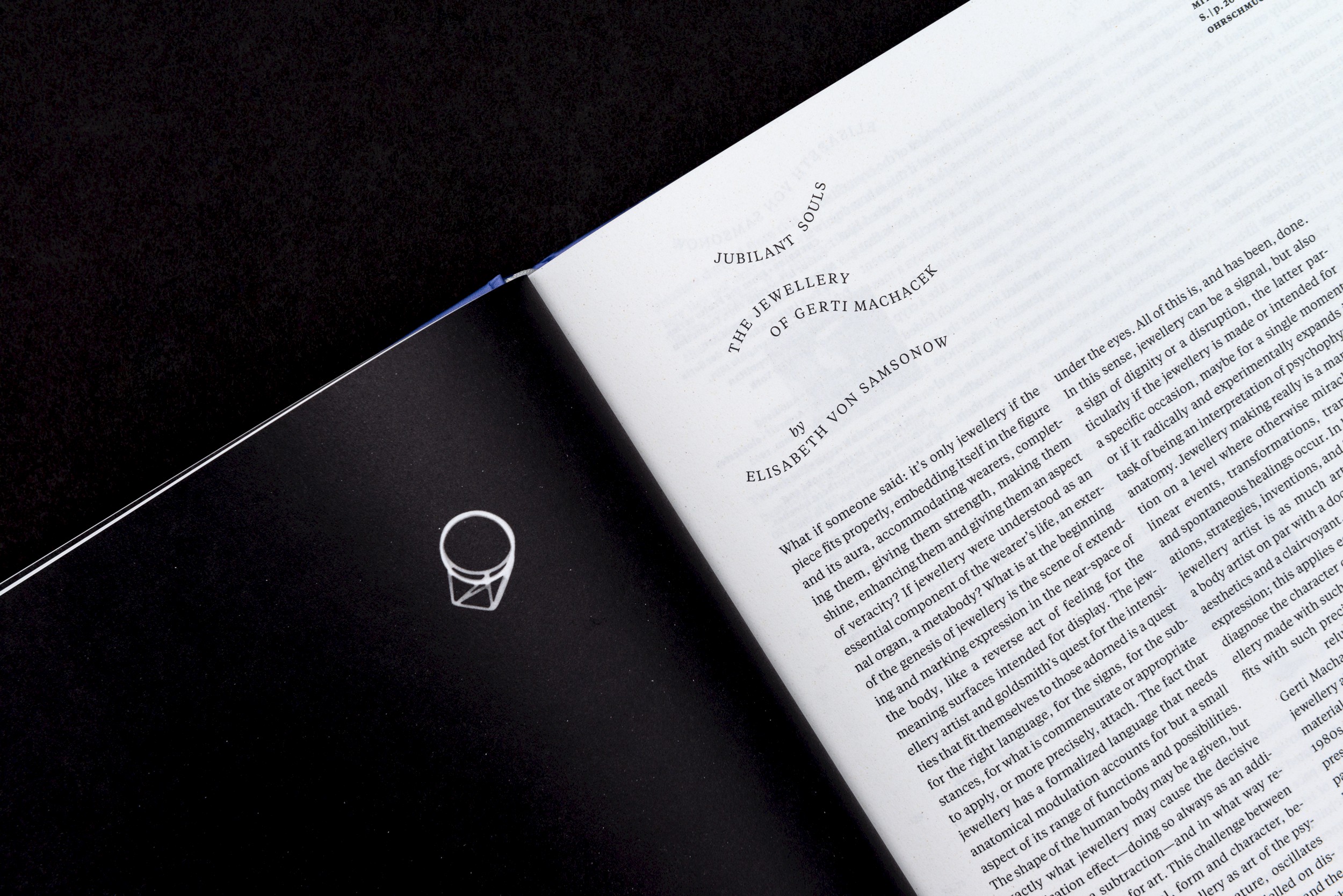
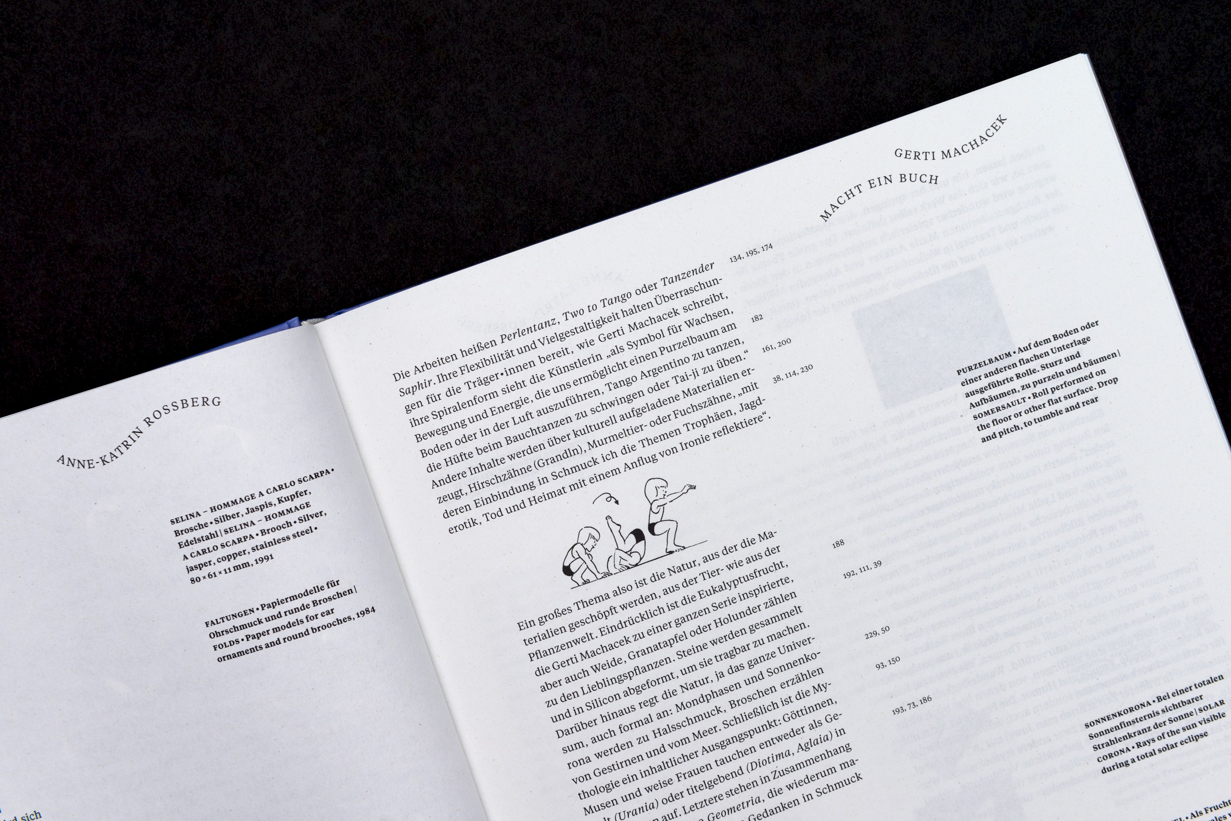
The flowing movement in the jewellery pieces is picked up typographically in the curved titles of the essays. On each page of text, the column titles create a new form, animating the names of the authors and essays as you flick through them, like in a flip book.
The justified text alternates between two paragraph widths in each language. This makes the paragraphs look like differently sized stones or pearls strung on a necklace. From time to time, a paragraph ends with a small illustration that illustrates a key term in the text. Even if they are not typographical ornaments such as fleurons or vignettes, the images function as humorous book decorations that emphasise aspects of Machacek's work. From the somersault to the pomegranate crown.
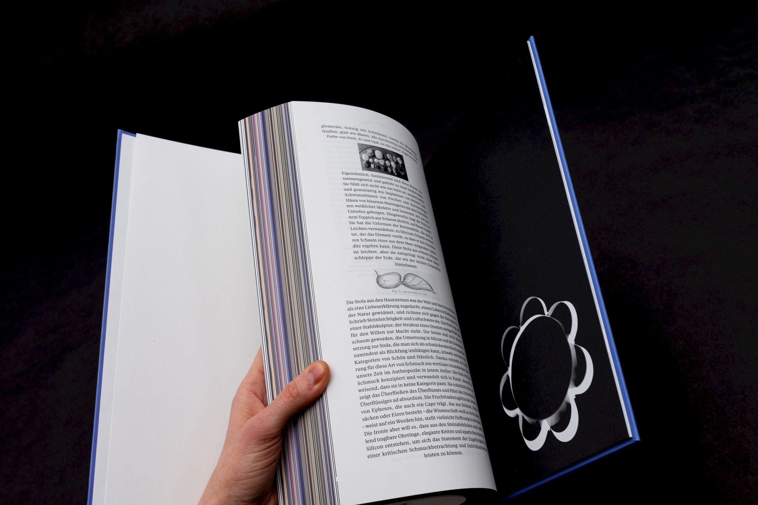
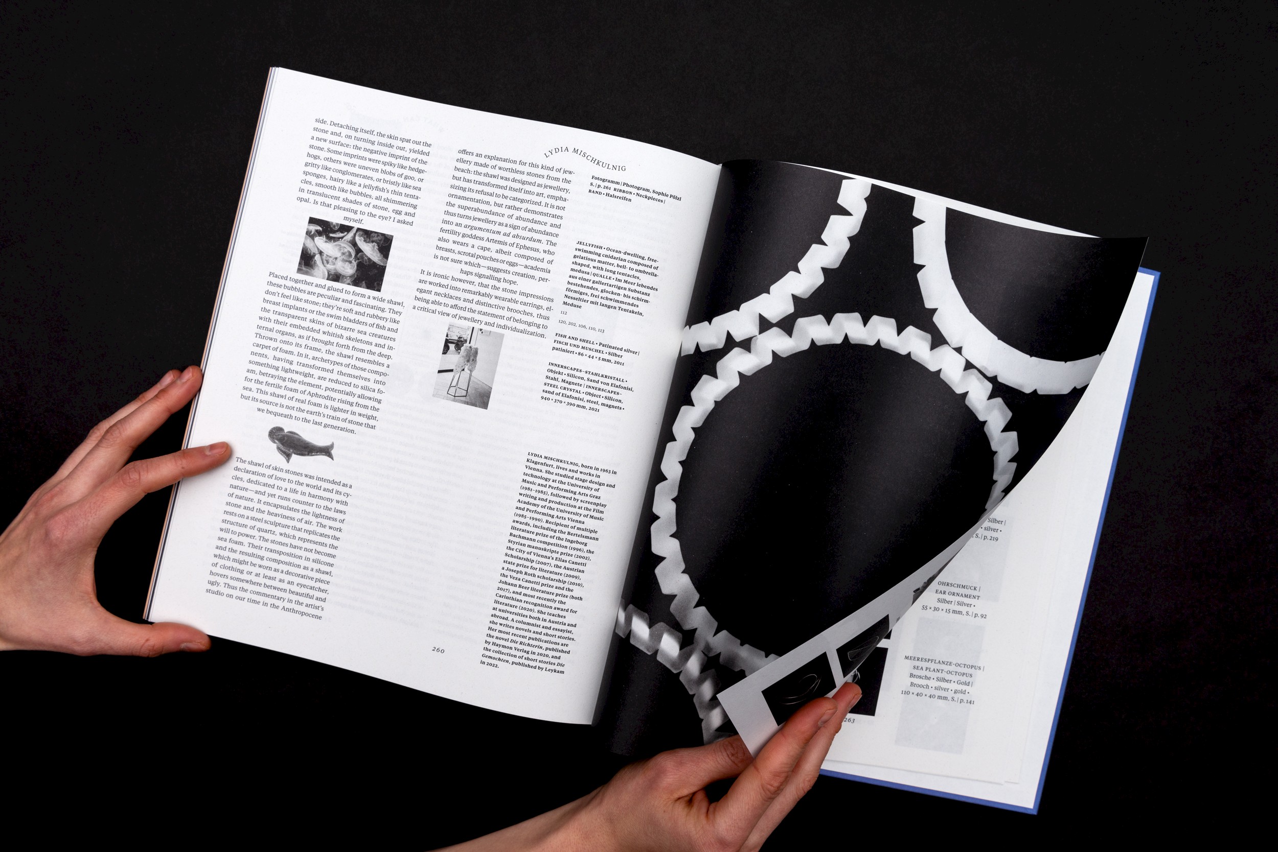
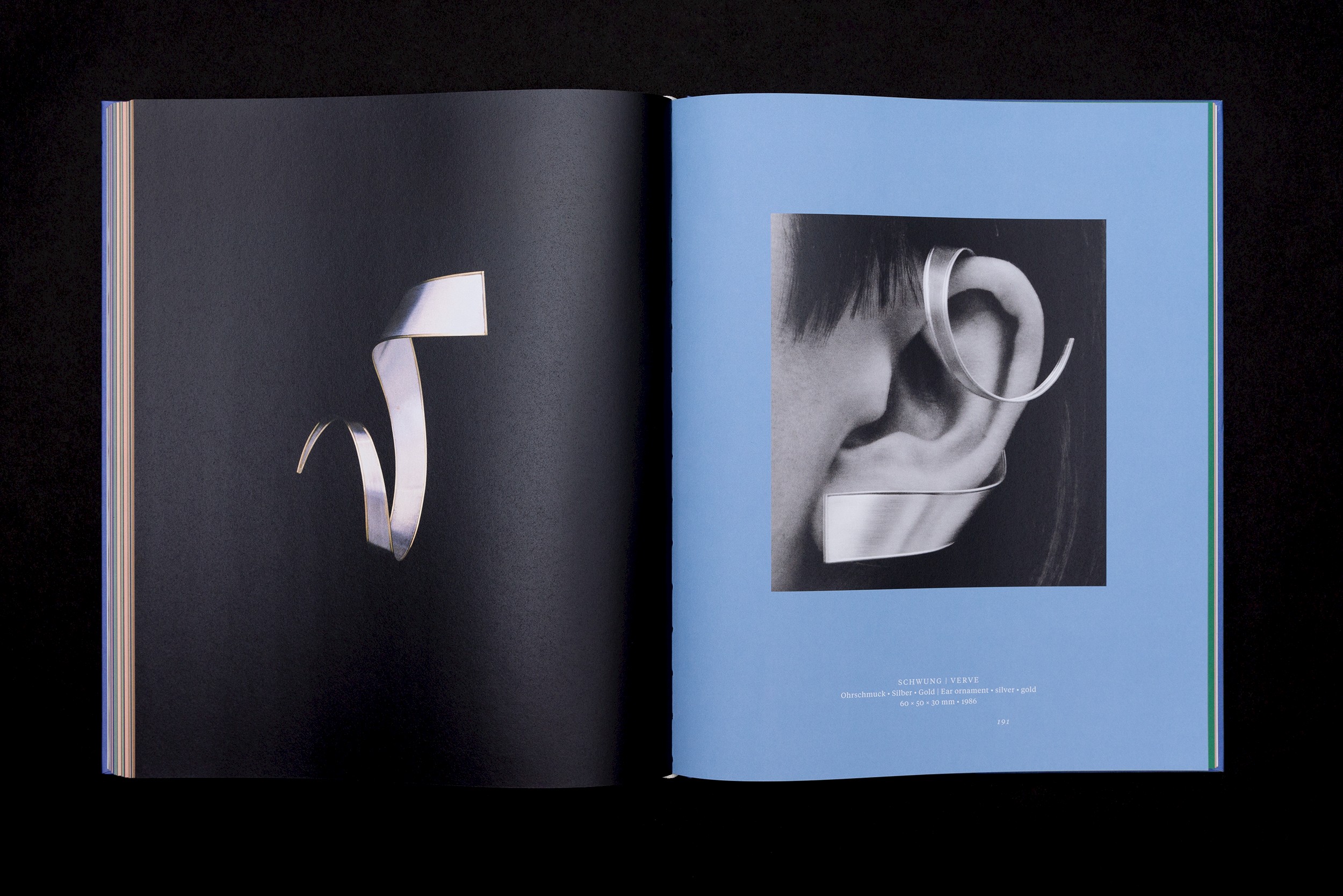
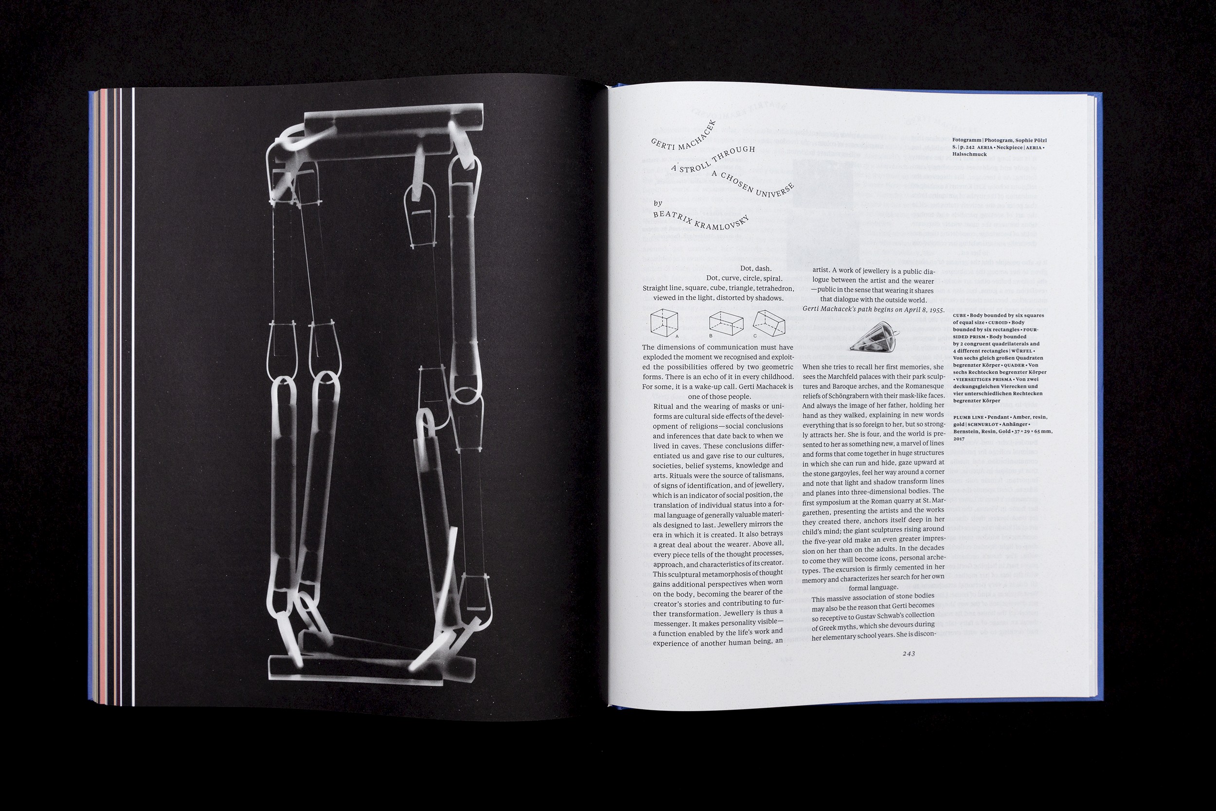
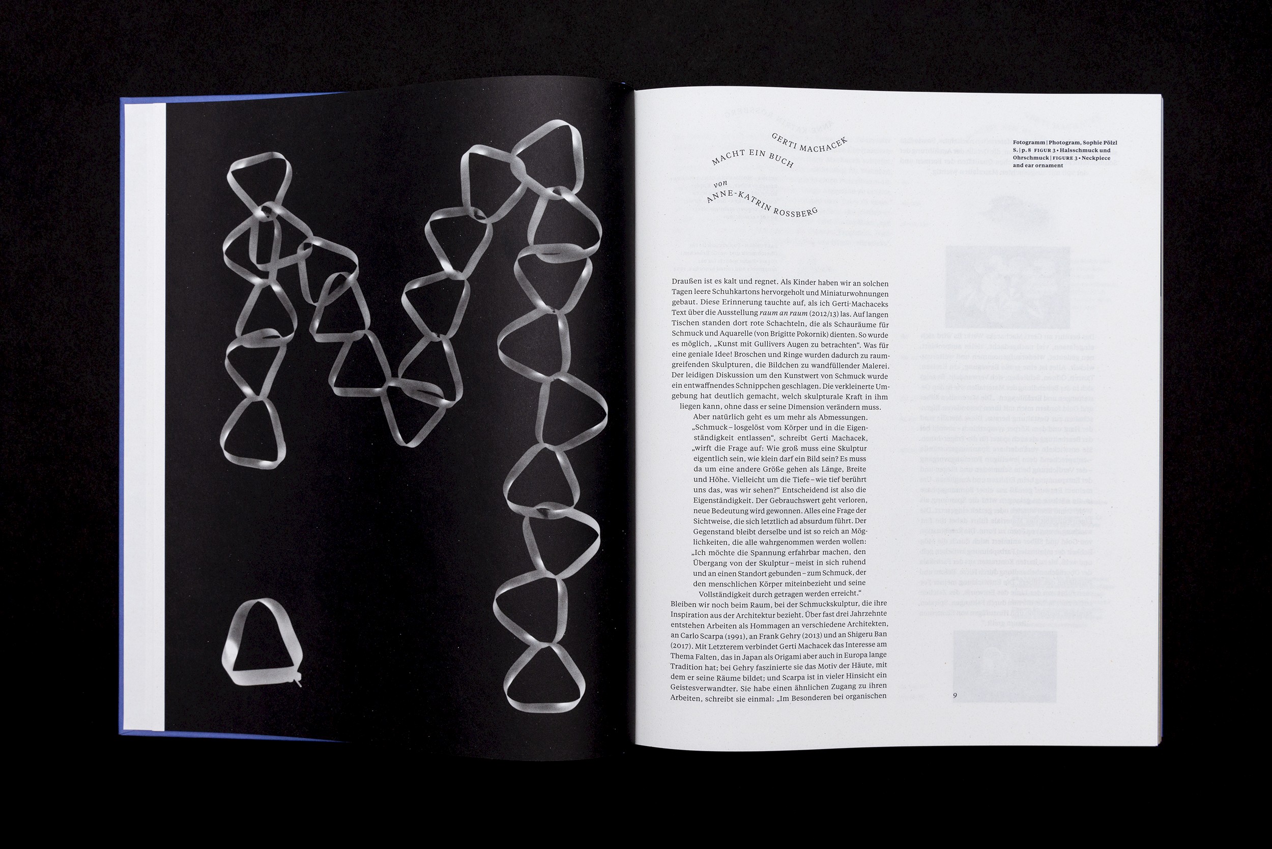
The animated, multi-layered pages of text are juxtaposed with Sophie Pölzl’s calm photograms in black and white, which emphasise the sculptural, clear form of the works.
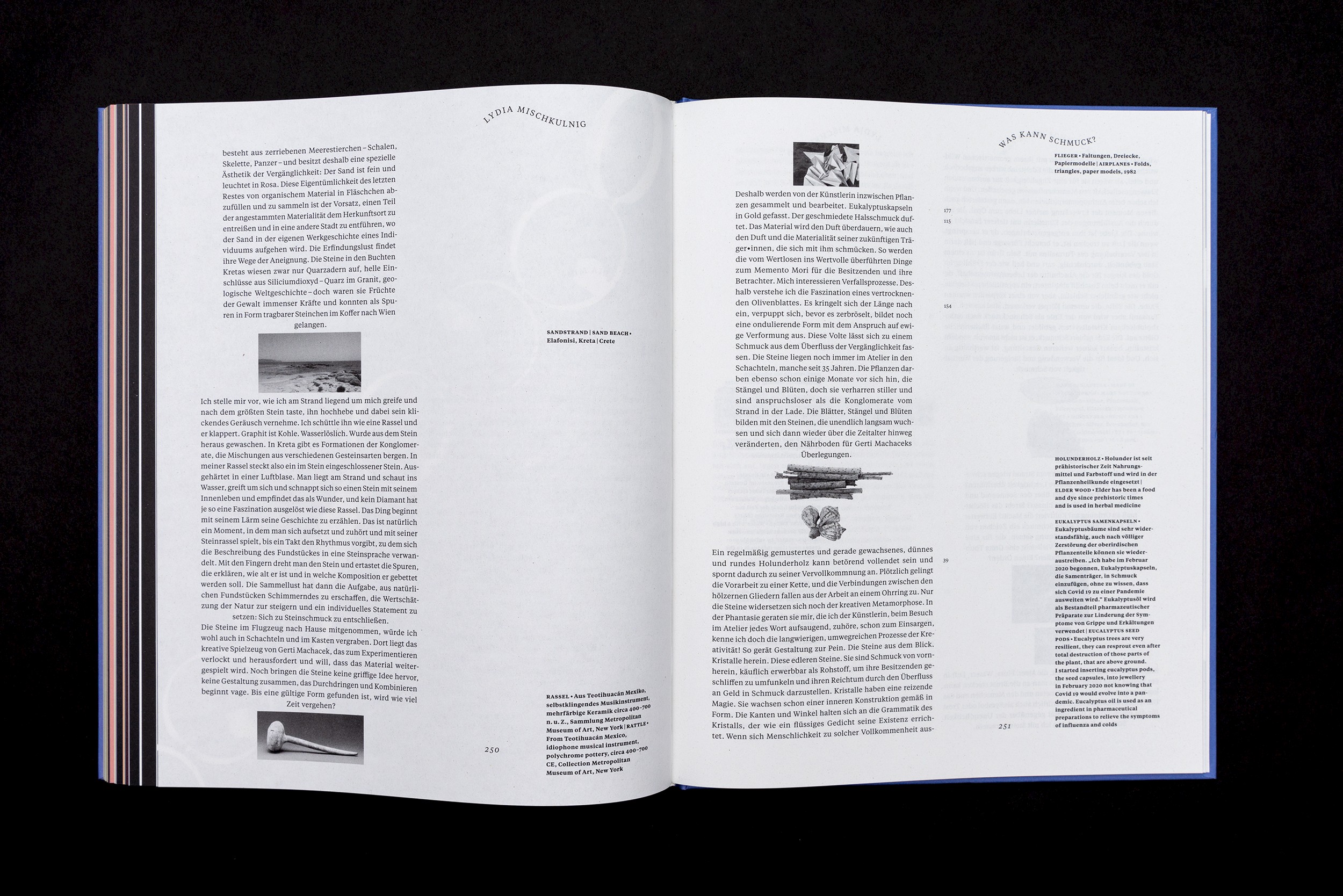
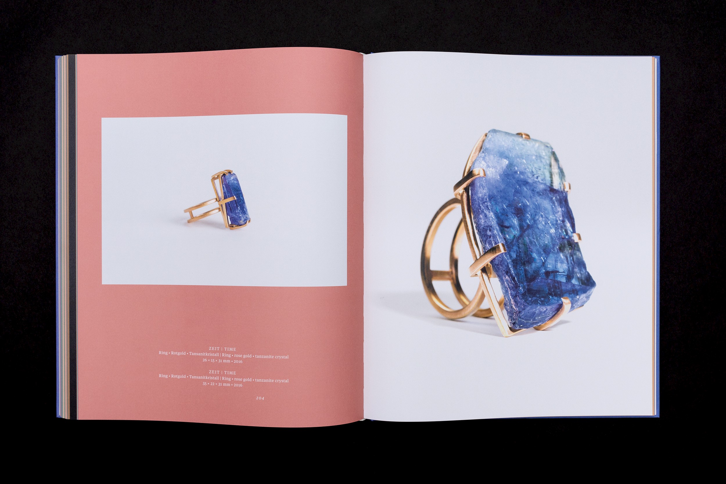
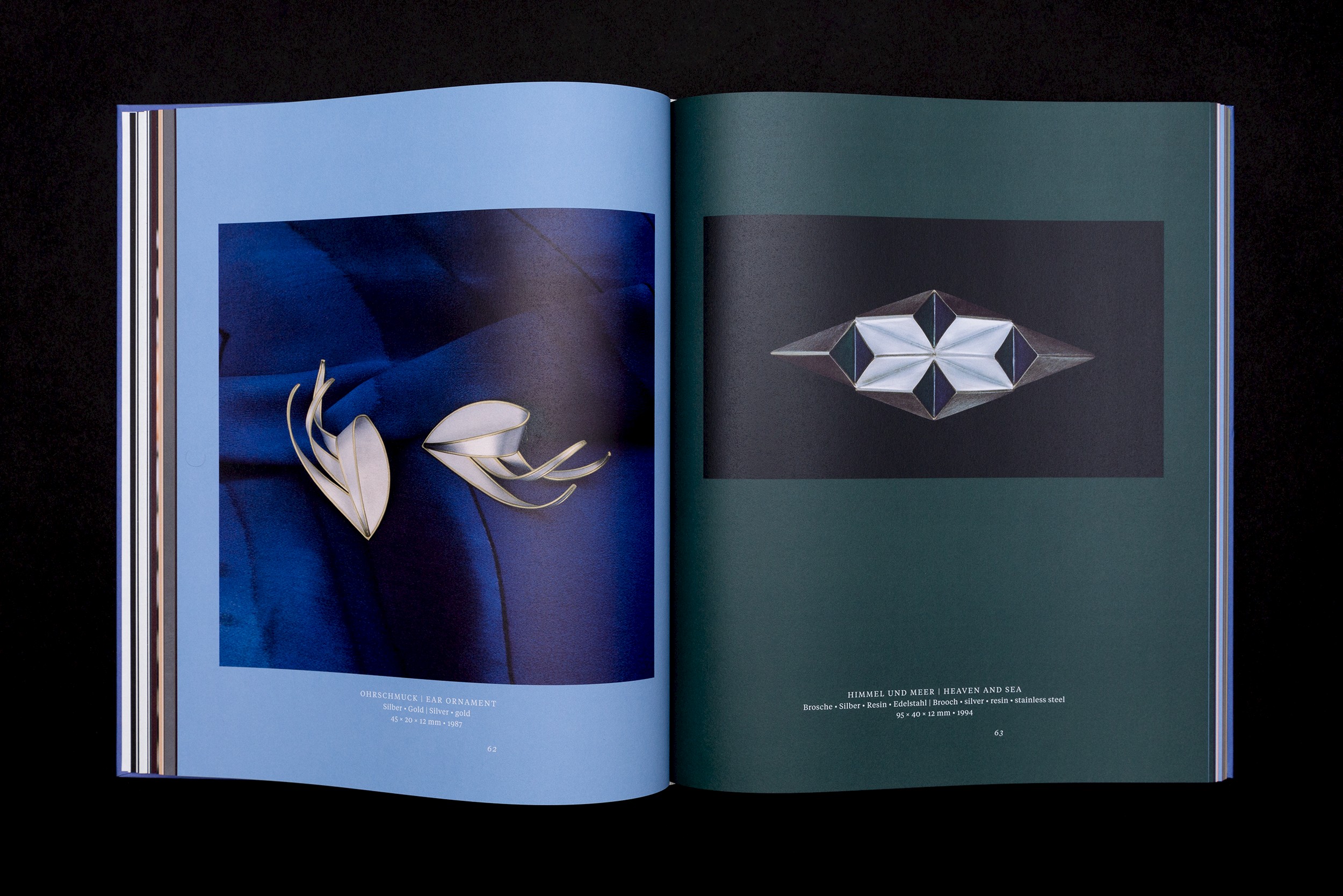
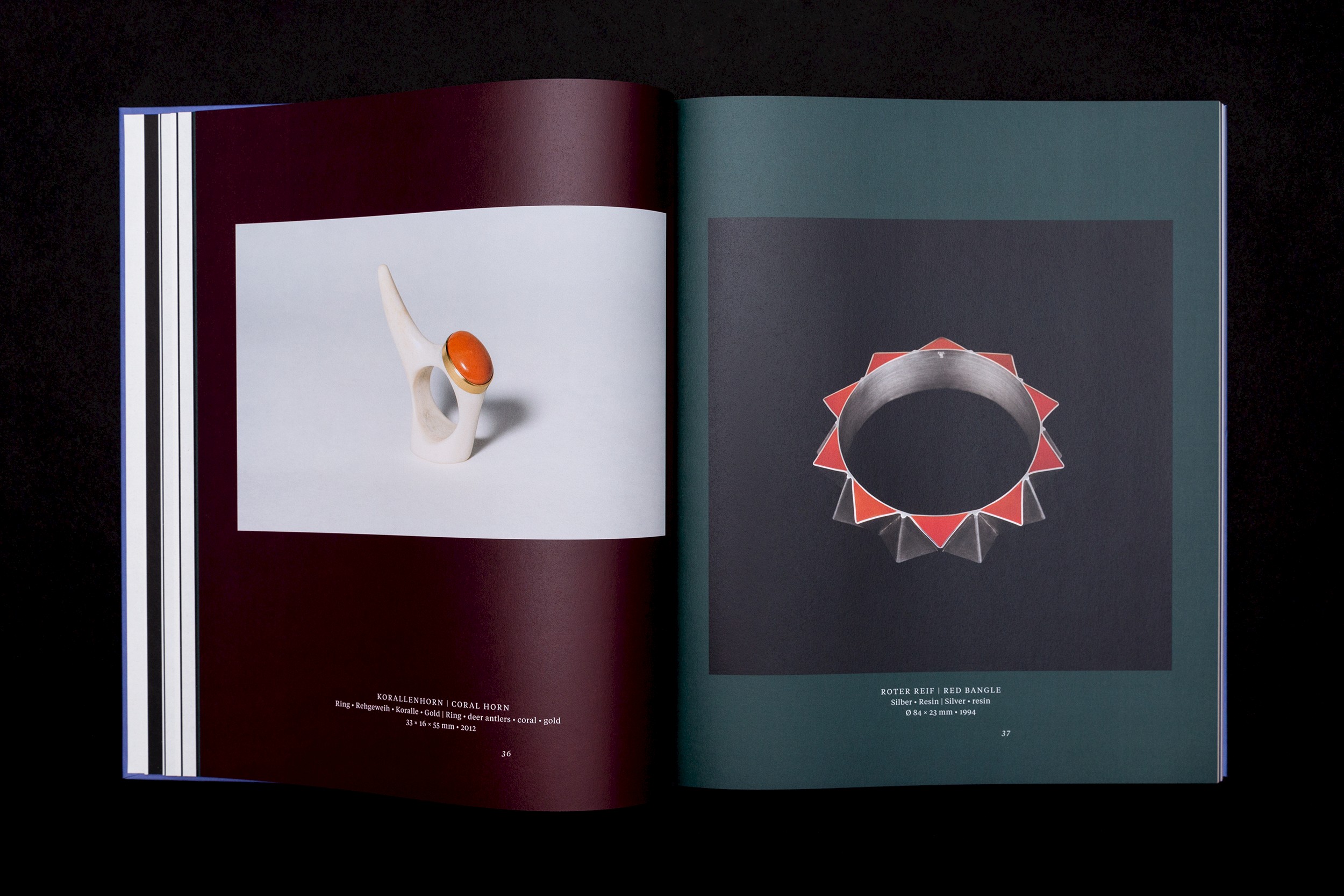
The texts and photograms are printed on the uncoated natural paper “Crush”, in which agricultural waste products from corn, citrus fruits, olive trees, lavender, coffee or cocoa beans are incorporated into the pulp. The special surface colouring and feel of the paper is a reference to Machacek’s intensive exploration of plant forms and structures. The coated paper on which the coloured illustrations are printed, on the other hand, has an almost chalky appearance. A reference to Machacek’s preoccupation with mineral elements. The images of the jewellery pieces were not intended to shine like in a glossy sales catalogue.
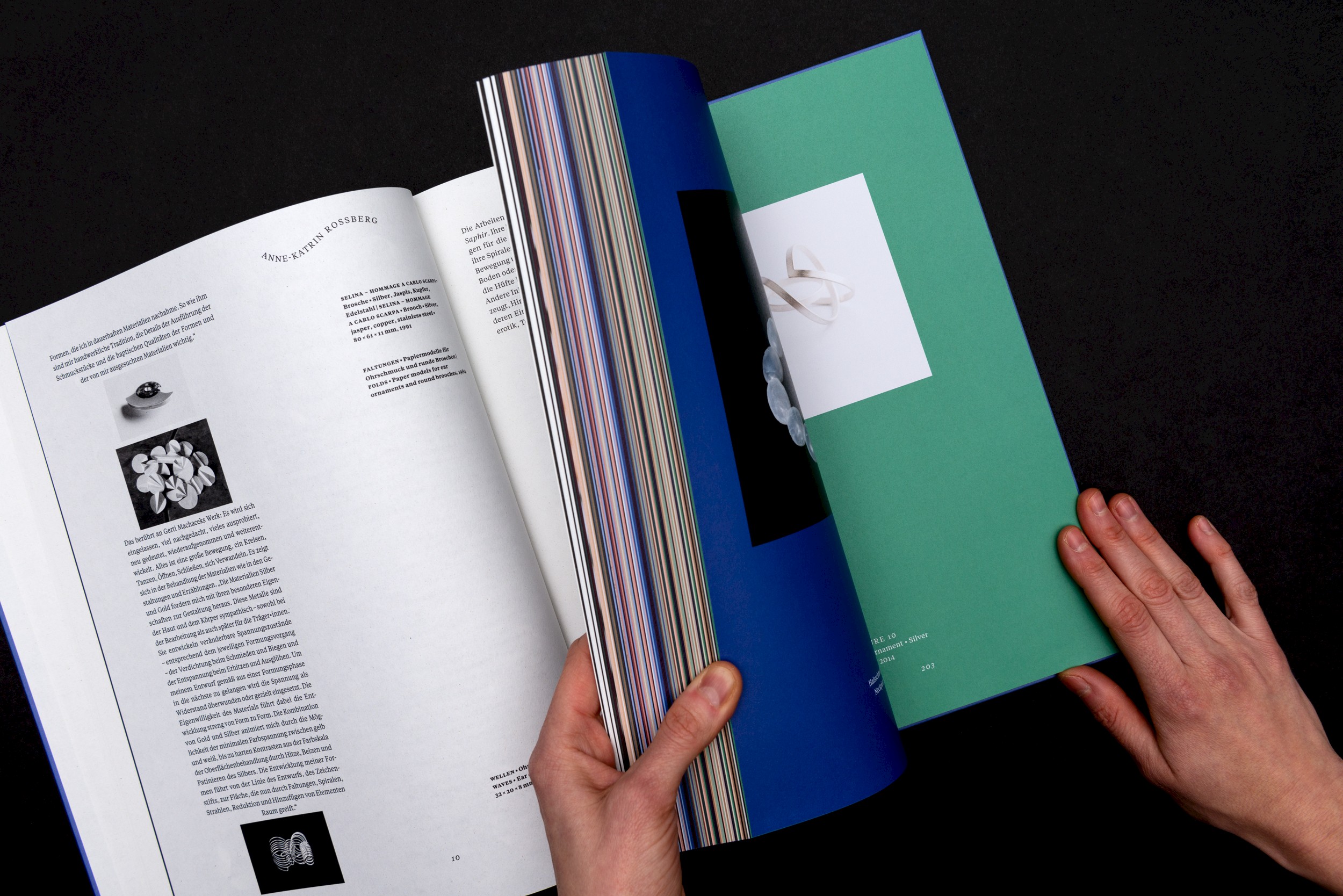
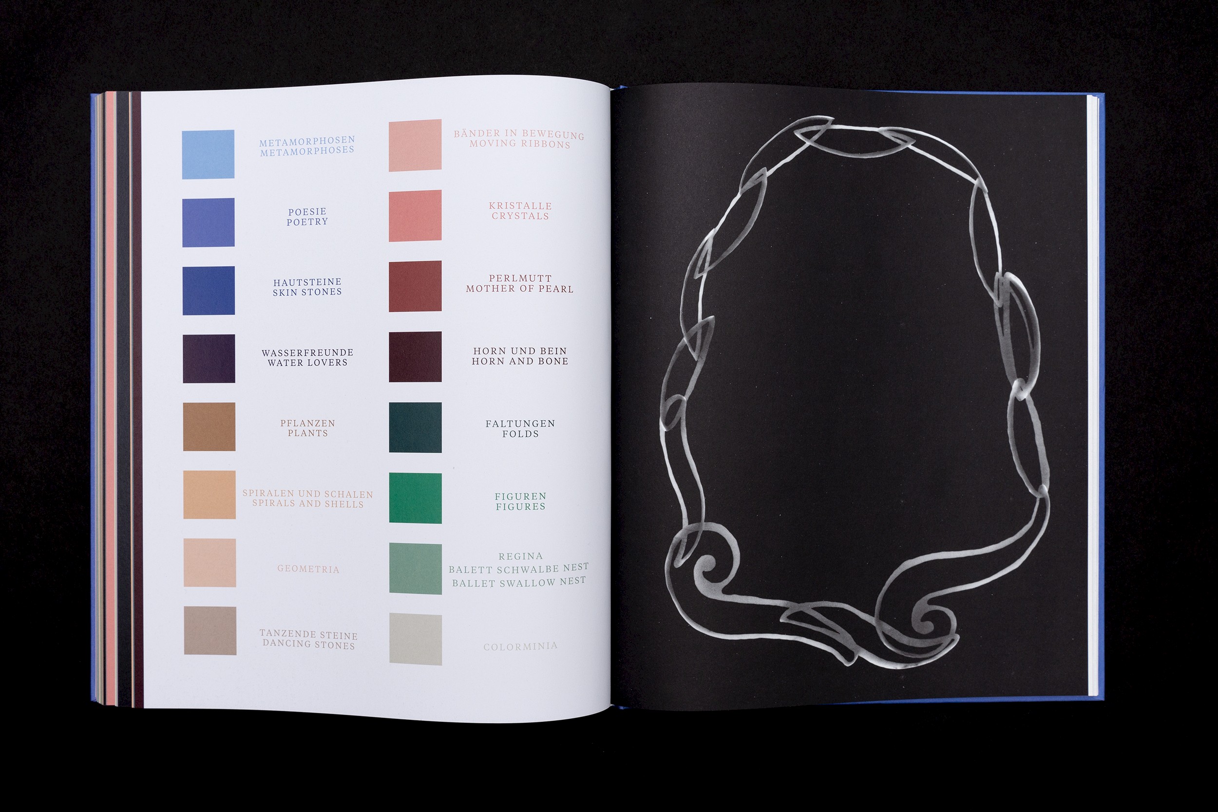
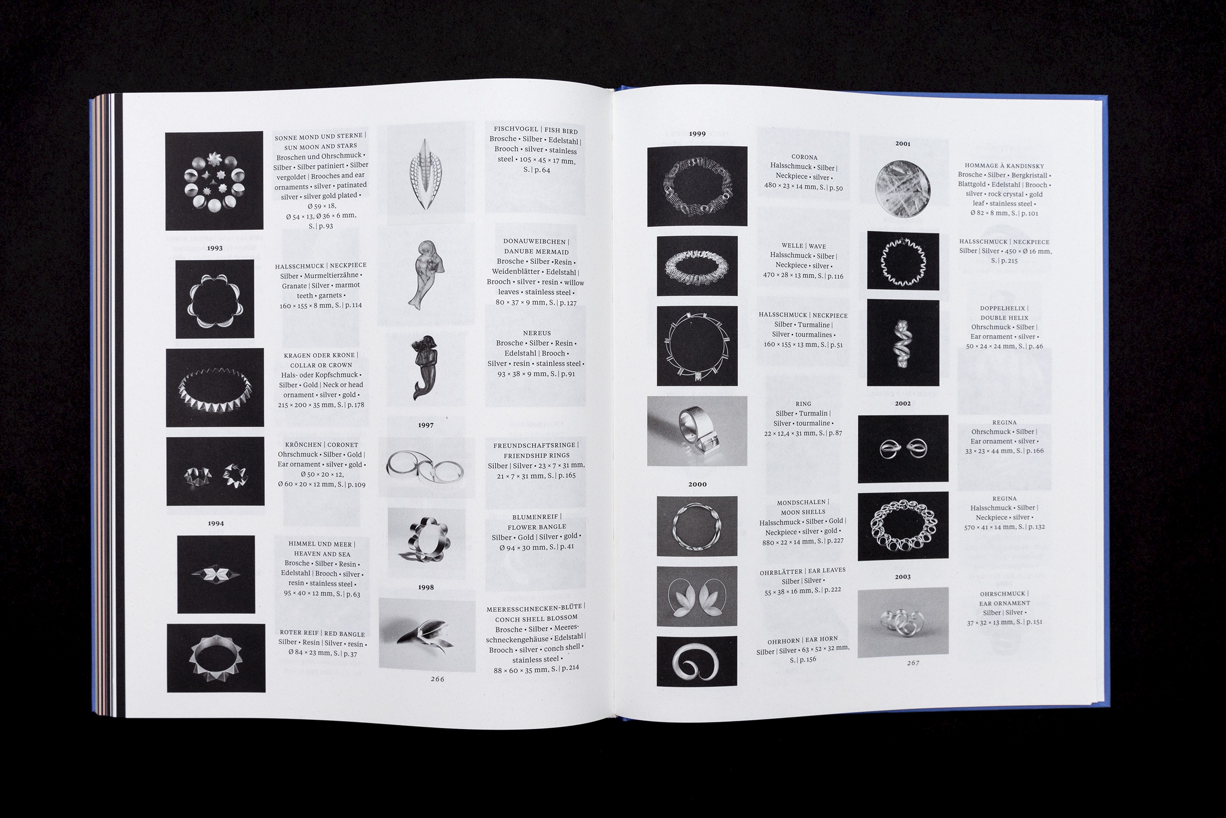
The monochrome text section encloses an extensive colourful picture section in the middle of the book. Machacek’s works are all assigned to a thematic category. Each category has been assigned a specific hue. A colour key explains the categories. The pictures themselves are not organised chronologically or categorically, but follow an intuitive layout that works with the visual material on a visual, chromatic compositional level. A comprehensive catalogue raisonné allows the viewer to view Machacek’s work chronologically in the appendix.
Studio photography by Sophie Pölzl
✷ Buy book