Christian Kosmas Mayer. First Monographs
- Editor(s): Phileas – The Austrian Office for Contemporary Art
- Publisher: DISTANZ
- Year: 2023
- Size: 21 × 28 cm
- Number of pages: 256
Part of the series of “First Monographs” initiated by Phileas – The Austrian Office for Contemporary Art. The series is dedicated to a first comprehensive collation of works by emerging artists who were born or live in Austria.
With texts by Noit Banai, Timo Feldhaus, Seph Rodney, Liv Nilsson Stutz, Sarah Wade, Stephen Zepke, and an interview between Mark Dion and the artist.
Christian Kosmas Mayer has created a body of work that preserves and produces a constellation of narratives about historical remains and representations. His projects, which are the result of extensive artistic research and close collaboration with experts, transform the insignificant and forgotten into artistic objects, installations and performances.
In the monograph the artist's collaborative and multi-layered approach is reflected in seven texts focussing on individual key works as well as the artist’s oeuvre as a whole.
The book is divided into 3 sections: introductory overview, text section, image section. Science and poetry are juxtaposed in the design.
The book opens with a selection of important projects from the last ten years, anecdotally introduced by the artist himself. The translucent paper, on which the overview is printed, allows the images of the chronologically organised projects to be superimposed, revealing conceptual correspondences between the works.
The titles of the essays typographically follow the scheme of a scientific form in which there is a field for the author, the text title and the title of the artistic work. The lines that mark the field to be filled in create a tabular aesthetic that is also used in the footnotes. The footnotes are inserted between the paragraphs, which breaks up the justified text. Although the text section has a more academic feel and the image section is more poetic, the essays feature typographical elements that break away from the clear, formal grid. The expressive character of the continuous text font is reminiscent of fairy tales and myths. A reference to the the mythological roots of science. The serif font is paired with Suisse Int'l, which is used for footnotes and additional information.
The third font in the book, Princess Lulu, is only used in the text section for the page numbers. Princess Lulu imitates an idiosyncratic, ornate handwriting and refers to the magazine “ztscrpt”, which Kosmas Mayer co-publishes. Each issue uses a different font and is also named after it. Issue 16 is titled “Princess Lulu”.
In addition to the chronologically organised overview at the beginning of the book, the sequence in the picture section follows an associative logic. There are different sections, each beginning with a short poetic sentence and then intuitively grouping works from different years.
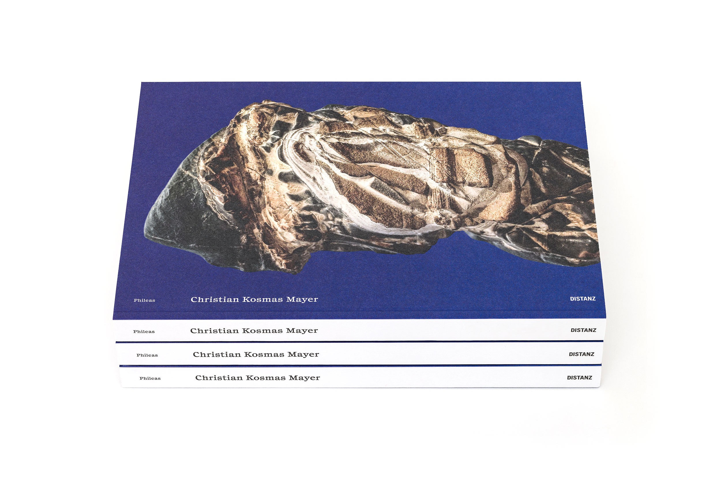
The cover image is a stone that looks like it has a face. A tongue-in-cheek reference by the artist to old master monographs, which traditionally use a portrait for the cover. The partial textured varnish on the stone creates a tactile experience.
Studio photography: Kunst-Dokumentation.com
✷ Buy book